
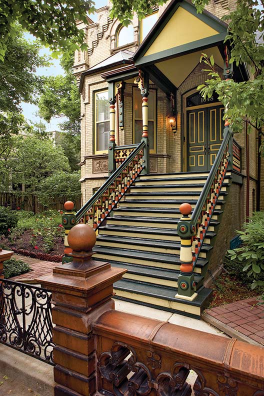
Victorian polychrome green, yellow, and orange paint scheme.
Jessie Walker
Exactly which colors to use is up to you. The rules below apply to color placement and harmony. These are basic principles—rules that may be bent or broken after you’ve taken them to heart. Of course, there’s no substitute for artistic instinct or years of practice. The first guideline, perhaps, is to keep it simple, especially if you are a novice.
Most unsuccessful polychrome schemes fail because the colors used are too bright, and the contrast between adjacent colors is too great. One way to avoid too-bright colors is to stick to a pre-selected historical paint line. Their colors generally are grayed enough to create a restful effect, and they go together.
The Guidelines
1. Use breaks between colors to enhance and highlight architectural components. This doesn’t mean merely making them stand out or look pretty, but rather using color to clarify the role and relationship among architectural elements.

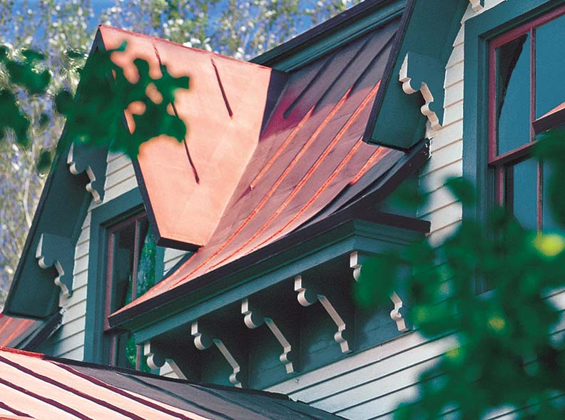
Victorian polychrome (purple, yellow and red) paint schemes.
Doug Keister
2. Remember that intensity appears greater when seen on a large surface (as compared to a small color chip or card). Similarly, the apparent contrast between two colors is greater when viewed on a large scale—on the building vs. on paint chips.
3. Avoid violent contrasts. Stark contrasts render one portion glaringly prominent and detract from architectural unity.
4. Avoid excessive highlighting of small architectural elements, incising, etc. You run the risk of getting a choppy polka-dot effect, rather than a harmonious architectural whole.
5. Use a transition color to buffer high contrast. For example, if you want to use burgundy moldings with pale putty walls, know that the two colors will present too high a contrast. A solution: transition bands or accents of warm gray and dusty rose between the putty and burgundy.
Victorian green and white polychrome paint scheme.
Courtesy of Preservation Products, Inc
6. Don’t feel you must break color right at the edge of a molding or change in plane. Sometimes bringing an adjacent color up over the first plane in a molding will knit the parts together, avoiding a static appearance.
7. Do make any changes of color at changes in plane. Changes in color or value suggest shadow, which occurs naturally at plane breaks.
8. Use a bright or strongly contrasting accent color effectively in small amounts: for example, as a stripe or as an accent color on a chamfered edge.
9. In general, paint projecting elements in lighter colors and recessed elements in darker colors (or shades). That way you’re working with the effect of natural light and shadow, not against it.
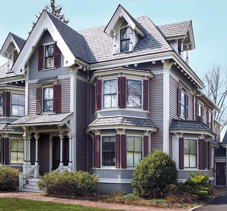
Victorian purple polychrome paint scheme.
Courtesy of Designer Doors
10. In general, use darker colors at the bottom and lighter colors at at the top of an architectural element. This arrangement is grounding and avoids a top-heavy appearance. That said, dark over light (as when the second story or top gable of a Queen Anne house is painted darker than the first floor) is an effective way to lower apparent height and bring scale to a building.
11. Try mixing a little of Paint 1 into Paint 2, or vice-versa, if you find that two colors are not harmonizing. This trick often helps two colors relate to each other.
12. Paint large-scale samples of chosen colors in place. Buy quarts. Paint a section at least 4′ square where your body, trim, and accent colors come together (say, clapboards/corner board/shutter). If you are not satisfied with your sample, it’s not back to square one. You’ll know, looking at the colors in place, what the problem is: red is too strong, too much contrast, or what have you.