The 180-degree swinging door linking the kitchen and the dining room is new, created from a five-panel door repurposed from elsewhere in the house and carefully inserted into the existing wainscoting.
When Marlee MacLeod and Corinne Wright bought their 1892 Shingle Victorian, which had been a rental property for decades, they knew it had been neglected, but they weren’t prepared for the foosball table they found in the dining room—a holdover from the home’s frat-house days. “The house was in a pretty unusable state,” says Marlee. “It was a sad house that needed modernizing and beautifying.”
The couple had a lengthy wish list of repairs, but they wanted to work within a budget and were prepared to take on as much work as possible to cut costs, preferring to put their money toward other things. “We wanted to spend our money on the best craftsmanship and architecture we could find,” says Marlee. Also high on their priority list was the creation of functional, low-maintenance spaces to accommodate the two dogs and three cats in the family at the time. “We didn’t want to have a house where you felt you couldn’t spill anything,” explains Marlee. “We wanted a place that would stand up to wear and tear.”
They brought this wish list to U+B, a Minneapolis-based architecture and design firm that prides itself on a highly collaborative design process. And that’s a good thing, because Marlee and Corinne had ideas about every aspect of the repairs, all of which centered on keeping the house’s history intact while bringing it back to life.
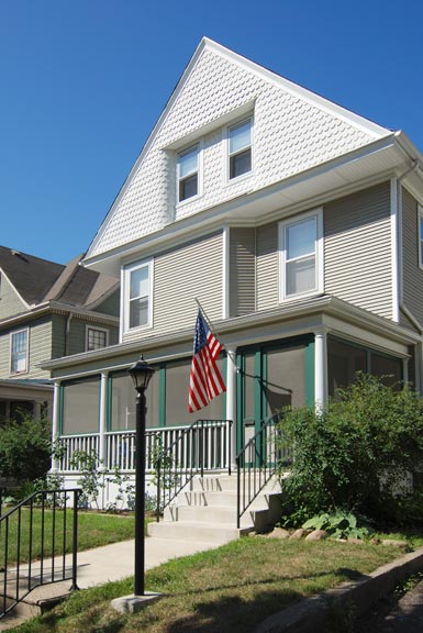
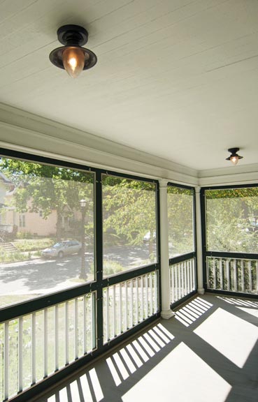

U+B’s project manager, Edie Sebesta, and Mark Burgess, the principal in charge, started their work on the full-width porch, which was basically falling apart. The couple wanted the porch screened in to contain their pets (and to have a place to eat outside without being attacked by Minnesota mosquitoes), and they also wanted it to be as maintenance-free as possible while keeping the feel of the original. So Mark and Edie replaced the rotted wood Doric columns with composites, “which are essentially maintenance-free,” says Edie. “They were delivered on site in several pieces, and the contractor cut them to fit in a manner similar to the way the originals would have been installed.”
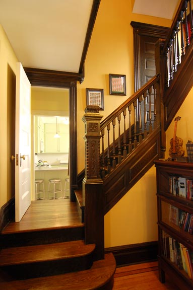
Inside the house, one of the biggest challenges was getting new millwork to blend with the old. There were pieces of trim missing throughout the house, which had to be replaced. “Base and chair-rail trim pieces had been chopped out through the years to add piping or other structural elements, so we had to have new router knives cut to match existing woodwork,” Edie explains.
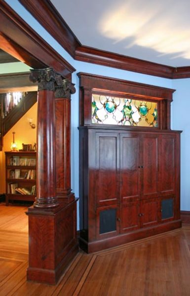
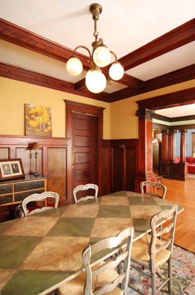
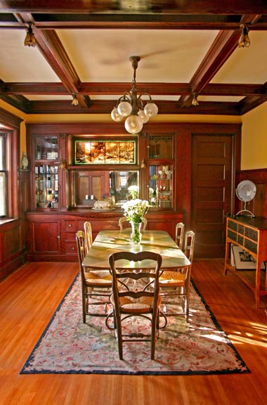
A custom, built-in TV cabinet was created to reclaim a space where a wall was long-ago removed. To channel the feel of the dining room’s buffet, it’s topped by a stained glass window featuring an abstract pattern of cats and dogs. The result complements the room’s grand original Composite Order columns.
That detailing was easy compared to the cabinet built to fill an opening in the family room where a wall was most likely removed, leaving an awkward shape. The cabinet’s design resulted from a bit of a disagreement between Marlee and Corinne. “I’m not a big TV person, but Marlee is,” Corinne says. One wanted a TV in the room; the other didn’t. The compromise: Hide it in a cabinet built to look original.
“We designed the cabinet to accommodate TV and audio and all the accessories, and be fully enclosed,” says Edie. “There are fabric infill panels that let sound travel through closed doors, and an eye in the wall that enables the remote control to operate.” The cabinet, which was built by Choice Wood Company, was stained on site to match the woodwork, and loosely modeled on the original buffet in the dining room. Adding to the antique feel, the piece is topped by a stained-glass panel bearing an abstract design of cats and dogs (to reflect Marlee and Corinne’s love of animals) in rich colors pulled from glasswork original to the house. It was created by Huntsville, Alabama-based artist Robert Perrella, who drove it to Minneapolis and installed it himself.
Creative woodwork also was finessed in the dining room, where an access door to the kitchen was added. “The trick was inserting a door into a paneled wall and making it look seamless,” says Mark. They succeeded, repurposing a five-panel door original to the house.
Original details inspired many of the Victorian paint colors the couple chose, too, as Corinne explains: “We pulled subtle colors out of the tile work surrounding the parlor fireplace and used them on the walls.” Marlee painted most of the walls, and along the way discovered a talent for refinishing hardware to match using paints and stains—in one case making a brass plate look like brushed nickel, in another making a plastic thermostat cover resemble old brass. “Our contractors knew from day one that if there was something we could do ourselves, we wanted to do it,” Marlee says. “We’re lucky they were OK with that.”
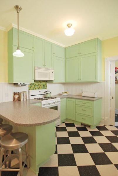
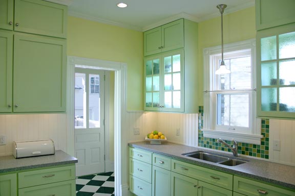
Beadboard was a budget-minded compromise that places an era-appropriate material around the kitchen without the expense of tiling all the walls.
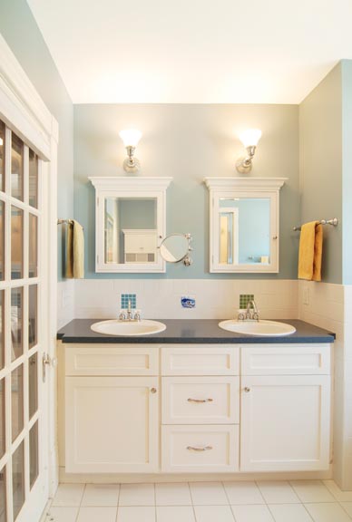
In the kitchen, the couple wanted to create an eating area, make better use of the space they had, and brighten up the dark room. U+B’s initial sketches for the room included subway tile on all the walls. “We just couldn’t afford to have the tile throughout,” says Marlee. So they settled on beadboard for most of the walls, and tile— purchased from an overrun sale that Marlee found online—for the backsplash behind the stove and sink. (In the upstairs bathroom, pricey art tiles pepper a generic field of white ceramic tiles, making a little go a long way. Marlee also saved money by “carting every single box of tiles to the house myself.”)
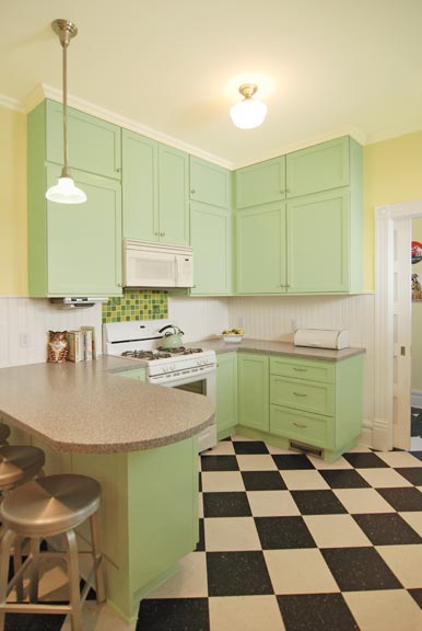
To eke out more space in the small kitchen, U+B inserted the refrigerator into what had been the servants’ staircase and reorganized the space, adding a small counter that fits three barstools for a cozy eating area. “We knew that if we expanded the kitchen, we’d have to give up things we love from the rest of the house, and we weren’t willing to do that,” Marlee says. “The only thing we gave up was the maid’s staircase.”
The company also moved the sink to the exterior wall, flanking it with glass-fronted cabinets. To get more light into the room, they added windows behind the cabinets. “You want a lot of light in a kitchen, but you don’t want to lose storage space,” Mark explains. “So we installed windows behind the cabinets and added an obscuring film so the neighbors don’t see all the dishes. It’s worked out well, because you also get light reflected off of the neighbor’s house.”
“Putting the windows behind the cabinets was brilliant,” raves Marlee. Corinne agrees. “The kitchen is such a great room—it’s all brand new, but feels like it’s been a part of this house forever.”