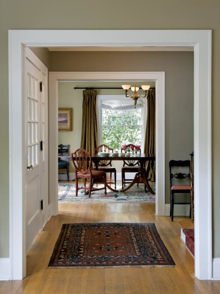
The house has an old-fashioned elegance, with great proportions and plenty of light. The 1940s Duncan Phyfe-style dining table and chairs belonged to grandparents.
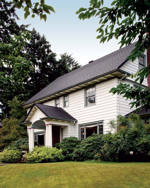
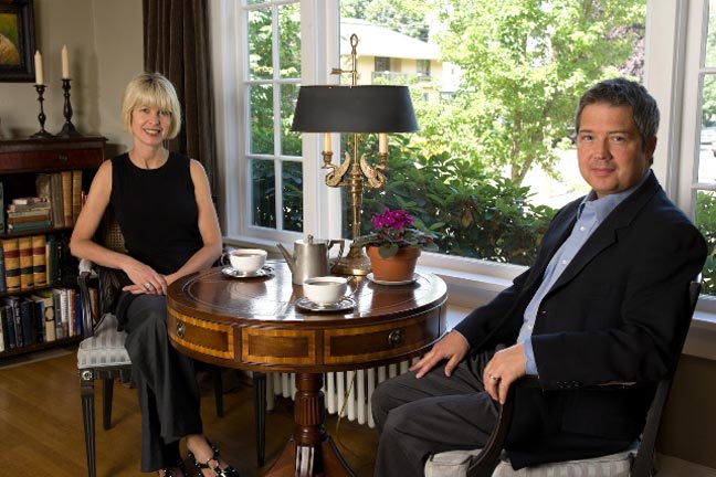
She’s been painting since age 10 and she majored in art in college, so it’s no surprise that Jenny Harmon-Scott became a successful color consultant and designer, inspired as she is by the opalescent wing of a beetle, the sheen of an old coin, the romantic glow of a painting by Turner. And so when she and her husband, Shay, purchased a 1927 Colonial Revival in the historic Irvington neighborhood of Portland, Oregon, she knew what it needed: a palette of period colors.
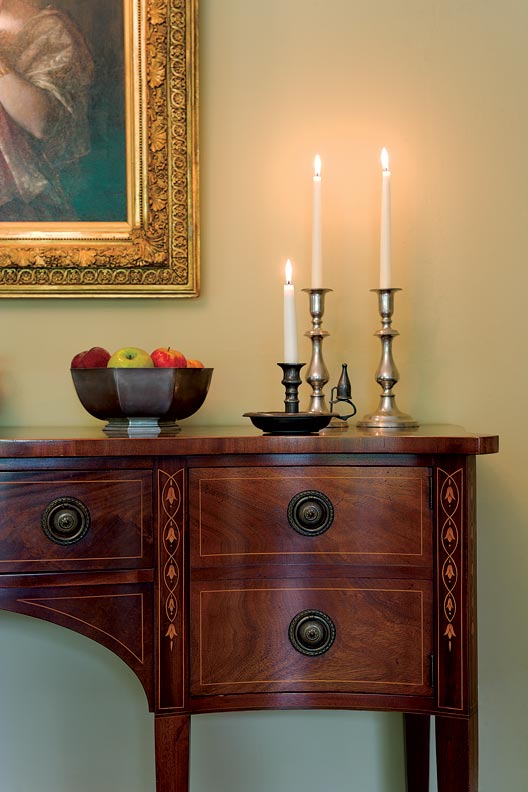
The house had an old-fashioned yet comfortable elegance, with generous, open rooms that boast good proportions, handsome moldings and woodwork, and wall space to display Jenny’s art. This house would be a perfect setting for their family heirlooms, including paintings handed down from her grandparents, a pump organ used by Shay’s great-grandfather (who was a traveling Bible salesman), and a handsome mahogany sideboard from Jenny’s grandparents.
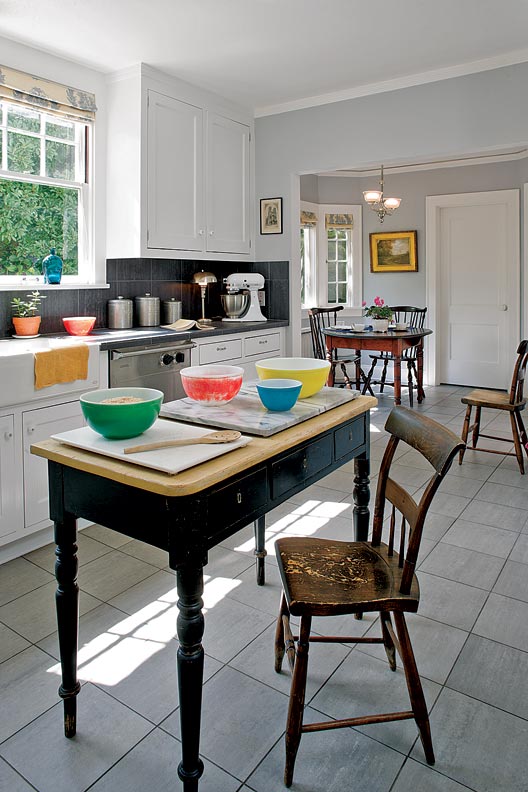
Still, the house needed updates. Built by a Scottish contractor, Robert B. Beat, it was structurally sound, but a misguided renovation during the ’70s had left its mark: a living room painted an unsettling green and the dining room too-bright pink; the kitchen cramped and uninviting with dark particle-board cabinets hung in the center of the room and floral wallpaper in orange and gold.
And so here’s where they started. Overbearing cabinets were scrapped in favor of straightforward paneled units copied from an original corner cabinet in the adjoining breakfast room. Jenny used her painter’s eye to choose a palette of complex neutrals, warm but not overpowering, reflecting the Colonial Revival house. Benjamin Moore’s ‘Sweet Innocence,’ a pale grey with a hint of violet, was used on the walls to bring light into the room; stainless-steel Viking appliances and nickel hardware diffuse and warm the refracted light. Smoky-grey Arizona ceramic tiles with a hint of red were chosen for the counters and floor, adding depth with the appearance of soapstone (but without the maintenance). A mix of antiques and family furnishings add character and personality: weathered, 19th-century pine chairs from Jenny’s family farm in Kansas, a vintage maple work table, a Colonial Revival gate-leg table that sits in the breakfast alcove.
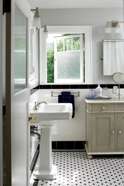
The upstairs main bath was next, submerged as it was in water-lily wallpaper in garish blues, purples, and greens, clashing sharply with peeling beige Formica countertops. Mirrors hung on all four walls magnified the discordance. The room was torn down to its lath and plaster and sensibly redone in a period-appropriate design. White subway tiles line the walls and the floor is tiled in black-and-white one-inch hexes, very probably the original scheme. A frosted-glass window original to the room was carefully cleaned. When walls were taken down to the studs, the ghost of the original medicine cabinet was obvious; its original door was discovered tucked away in a basement corner, so the cabinet was faithfully re-created. A clawfoot enameled tub from Rejuvenation, vintage-style pedestal sinks, and the company’s polished-nickel ‘Deschutes’ light fixtures and hardware give the bath an early-20th-century look, yet the bathroom is up-to-date and convenient.
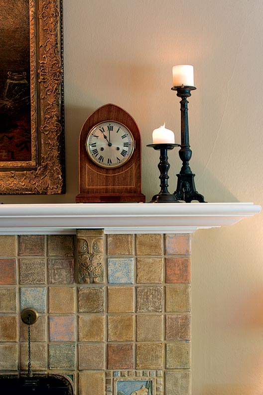
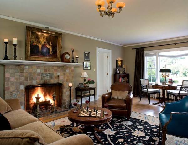
Soft neutrals in the original Batchelder tiles suggested a “light coffee” color for living-room walls. Brass andirons warm the browns. Leather club chairs join an English-style rolled-arm sofa. A 19th-century oil hangs over the fireplace.
Jenny’s talent for color is on display in the living room, which had been a startling spearmint green, not a good choice to go with the tertiary terra cottas of the Batchelder tiles in the fireplace. Taking a cue from the lovely tiles, Jenny chose Pratt & Lambert’s ‘Light Coffee,’ a warm and sandy brown, for the walls. Furnishings were chosen for their color and their design, adding contrast in an integrated manner. Brass andirons add depth to the brown walls; rusty wrought-iron candlesticks accentuate the red in the tiles; the covers of old books stacked on tables complement blue and green highlights in the tiles. Chocolate-brown velvet curtains replaced insulated foam shades. Honey-tone woods were chosen for the furniture, leather club chairs with an English-style rolled-arm sofa from Rejuvenation.
Paintings add discreet color accents; one of Jenny’s favorites is a late-19th-century oil from her grandparents’ home, now hung above the mantel. Timeless harmony is the result of small things: doors missing from the adjoining sunroom were milled and hung; plastic switch-plate covers were replaced with brass ones; a 1920s French chandelier was installed overhead.
It may look utterly original, but the upstairs bath was a do-over. This version is period-perfect with black and white tiles and nickel fittings. The restored window with frosted glass was original to the room.
The dining room had been painted bubble-gum pink. Jenny chose the aged-looking gold tones of Pratt & Lambert’s ‘Ventana’ to bring the room a sophisticated, early-20th-century look. The creamy-gold walls are the perfect complement for the red mahogany tones of Jenny’s grandfather’s 1940s Duncan Phyfe-style dining table and chairs, as well as the gilt frames of oil paintings hung on the walls. An inlaid mahogany sideboard (also from her grandparents) displays family silver, and an early-20th-century brass chandelier and moss-colored velvet draperies complete the return to classical Colonial Revival refinement.
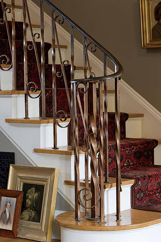
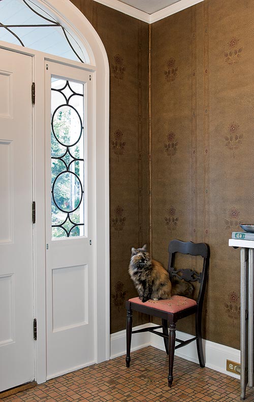
In entry hall and stairwell, Jenny wanted something enduring, a color tolerant of scrapes and scratches that would also highlight the gleam of the gilded wrought-iron railings and provide a backdrop for more oils and etchings. She chose Pratt & Lambert’s ‘Silver Mink,’ a powdery gray that’s quiet and welcoming and also complements the burgundy and blue jewel tones in the oriental carpet runner on the staircase.
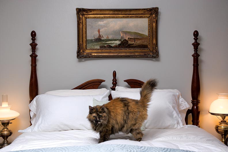
Upstairs, the master bedroom runs the width of the house. Even though it has its own fireplace, it was cold and uninviting, painted a restless peach. Jenny settled on Pratt & Lambert’s ‘Pearl White’ in an eggshell finish, lending tranquility and making the most of the light. Furnishings here include a mix of contemporary pieces and antiques, including a ca. 1890 oil of Copenhagen hung over the bed.
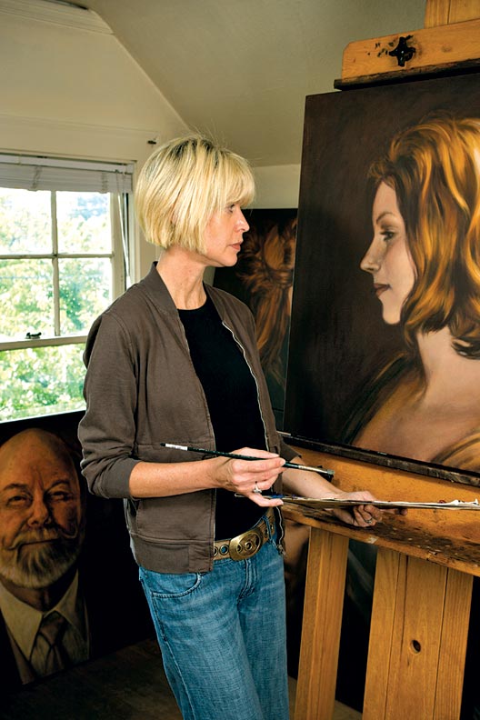
Drawn to the wide, westerly windows that let afternoon light stream inside even on the Pacific Northwest’s infamously rainy days, Jenny chose the generous third floor for her studio. Here she can be found painting her latest portrait or quietly pondering colors for a design project. She says color is the foundation of good historical design.
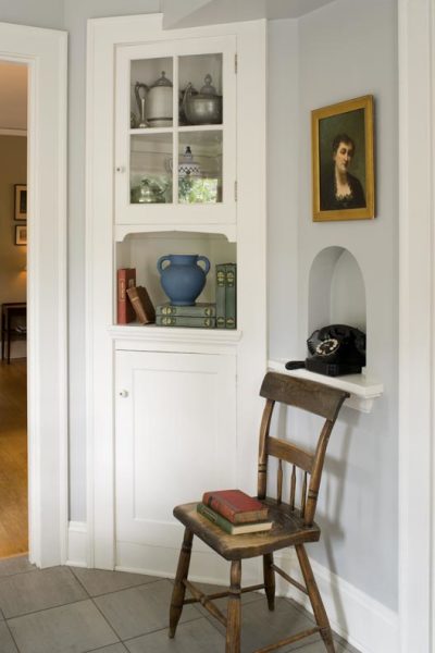
This painted corner cabinet, original to the breakfast room, inspired the straightforward design of the paneled kitchen cabinets. They replaced the dark particle-board units of a floral orange 1970s remodeling.
Colonial Revival Color: 5 Tips
Neutral, calming colors that include soft greys, off-whites, and tans are the basis of a sophisticated palette that complements the classical elegance of Colonial Revival homes and interiors.
Think of the house as a whole, and chose colors that flow from room to room.
Good paint is worth the investment. Cheap paints fade and look dull quickly.
The finish is key. Jenny favors soft matte and eggshell finishes on the walls, with satin or semi-gloss for the woodwork, because higher sheen gives molding depth to frame the walls. (Higher gloss is also easier to wipe clean.)
Grays are tricky and change with the light and adjacent colors. Use a crisp white to tone down and neutralize gray; a softer off-white with yellow or pink undertones will warm gray.
Be careful with taupe, essentially a warm gray-beige. Jenny likes to use taupe with gold or green rather than with red or pink, to keep the palette harmonious.