A house does not have to be big to possess the self-assurance of the finest old homes. Quality materials and careful craftsmanship build character and charm, regardless of a home’s size. Architect Peter Zimmerman, who is often called upon to create designs for large estate homes, recently got a chance to prove the point when he designed a cottage in Elverson, Pennsylvania, west of Philadelphia.
“So many houses seem as though they’re trying to be architecture (with a big A)—the monument on the street,” says Zimmerman. “As with all of my houses, I wanted this house, although smaller, to be more about proportion, scale, and details, the close experience of the architecture by the user, not one of those houses that says ‘Look at me.’”
Ironically, the closer you get to the house, the harder it is to take your eyes off it.


The project came about when a developer asked Zimmerman to develop a concept for a small community of homes on a wooded golf course. The architect designed the pilot house for imaginary clients—an older couple downsizing from a large home. Like all the houses in the village, it was limited to 2,700 square feet of living space, including a guest apartment above a detached garage, leaving the cottage itself with little more than 2,500 square feet.
Rather than bemoan the size restriction, Zimmerman—inspired by early-twentieth-century cottage communities up and down the East Coast—seized the opportunity to create an understated jewel with traditional detailing. More than ever, the architect had to draw on the timeless qualities of old houses to pull it off.
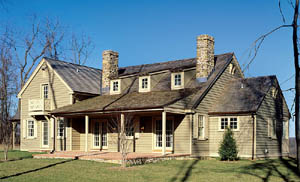
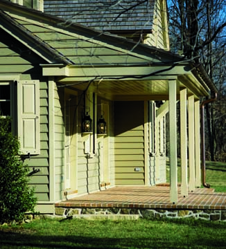
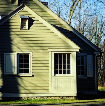
Zimmerman chose a simple cottage form—a pair of story-and-a-half boxes set perpendicular to one another with small appendages tucked onto each end. Two stories would have been proportionally all wrong, he says—too large for the setting. Though the plan worked, its small footprint left the architect very little residual space for outdoor rooms. “I didn’t have enough architecture to create a courtyard between one wing of the house and another wing,” he says. His solution? To use a short wall jutting out where the two boxes meet as a corner for a covered brick porch. “It takes three corners to define a space,” he says. “In this case, there’s one corner. The posts loosely define the other two corners. And the ceiling gives the porch a sense of intimacy.”
The interiors are contemporary, fresh, clean, and bright.
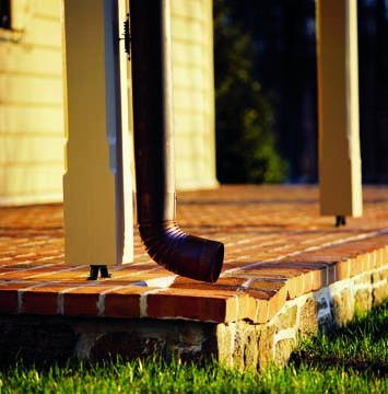
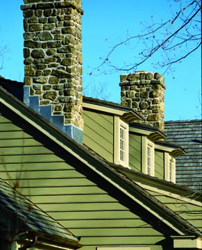
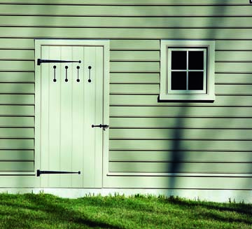
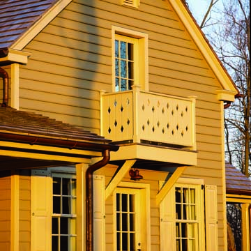
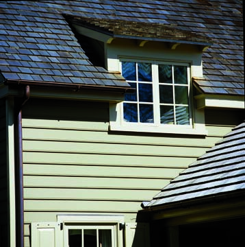
The architect had the cottage clad in handsome beaded cedar boards with a transparent stain. An extra-bold bead keeps the siding boards from blending with the unbeaded corner boards and door and window casings. Likewise, he added a water table skirt board to separate the fieldstone foundation from the clapboards. Other impressive exterior details: a custom-made cabinet to hide the electric meter, old-fashioned cast-iron boots to lift the porch posts off the brick, and a section of cupped brick to channel water beneath a downspout.
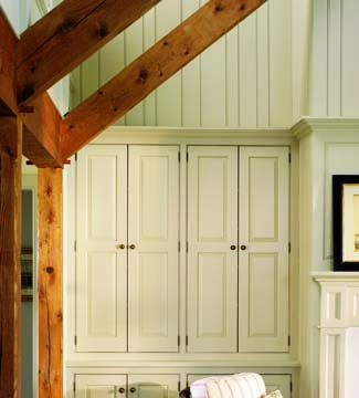
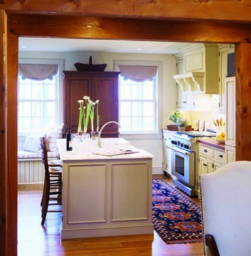
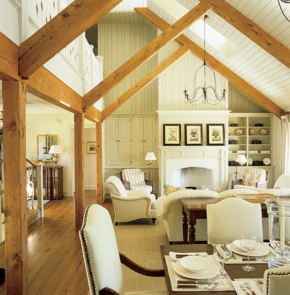
Inside, the architect worked to maintain the cottage scale while also making the floor plan more open and livable by today’s standards. The centerpiece is an airy, light-filled great room with a soaring ceiling held aloft by pegged fir beams. Modified Rumford fireplaces stand at either end—one facing a sofa and chairs, the other a dining table—their whitewashed walls slanting inward to throw heat back into the room.
Even more remarkable, however, are the subtle details Zimmerman added to give the great room intimacy, lest it feel like a vast drywall box. The rich, naturally finished post and beam home frame a smaller peaked space within the larger expanse. An overmantel high above each fireplace forms a dividing line between the lower part of the room and the open “attic” above. Above that dividing line, the sloped ceiling and upper gable ends are beadboard (not Sheetrock), which adds texture and gives yet another visual clue that while the light may dance up to a height of nearly 20 feet, you’re safely ensconced before the fire in a space comfortable enough for two or three people.
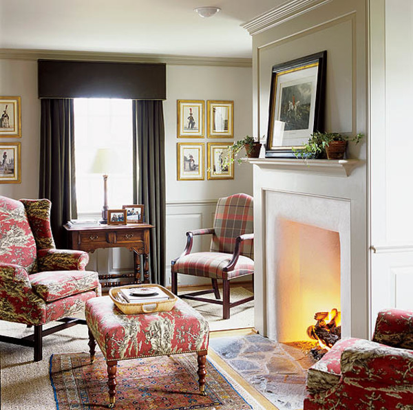
A sitting room offers Colonial detailing, including this warming hearth.
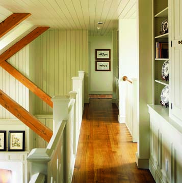
It’s all about adding layers to a space, Zimmerman says. The beams are a spatial layer. The overmantels add a layer of definition, reminding people where the ceiling would have gone. He achieves something similar—the sense of an assemblage of rooms without the stuffiness—with an open hallway running the length of the cottage, from the informal family entry at one end of the house to the master bedroom at the other.
“I tried to create multiple zones as you enter the house,” says the architect. “You step onto the front porch, enter the foyer, and then enter the hallway, the great room, and finally the back porch. This little house may be very transparent, but it’s not thin architecture.”
The hallway solved another problem open-plan houses have. “People want kitchens and living spaces merging together, but that can create real problems spatially,” Zimmerman says. “Rather than have the kitchen only separated by the thickness of one wall or no wall, I used that hallway to push it back. The kitchen and great room are still open and connected, but they’re not on top of each other, so that after dinner you don’t feel like you’re living in the pots and pans.”
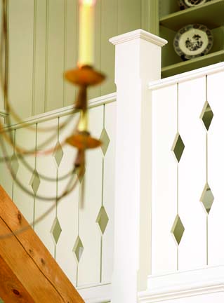
The hallway gets repeated in the half-story above, along a gallery overlooking the great room. It leads to a pair of guest bedrooms and a bath. Here, as below, Zimmerman gets lots of mileage out of the long, narrow space. Awash in natural light from several shed dormers poking through the sloped roof, the gallery is lined with bookshelves, creating as much linear shelf space as a small dedicated library room. And the railing is ingenious. A row of wide boards with diamond cutouts, the barrier is both attractive and mostly solid, acting as a sort of half wall. Sit to read, and you’re in privacy; stand, and you can converse with those below. The railing’s posts alternate in height and thickness, creating a crenellation that stops the eye, clearly defining the public foreground space from the private background space—again without fully walling it off.
With these two hallways—as with the entire cottage—Peter Zimmerman proves that when it comes to good architecture, size doesn’t matter.