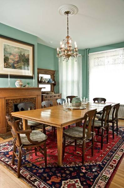
The dining room houses an Eastlake sideboard, which became the inspiration for the new kitchen cabinets.
Andy Olenick
For Nina Donnelly and Russell Lane, it all started with the kitchen. From the time they purchased their 1887 Queen Anne Victorian in Evanston, Illinois, reworking that primary space topped the to-do list. “We knew we needed a new kitchen when we moved in,” says Nina. The room didn’t suit the house very well, and a 1980s-era renovation had created an incongruous two-story space with a prominent metal spiral stairway at the back of the house. But by the time they were finally ready to tackle that project some 10 years after they moved in, their list had grown beyond just the kitchen.
Finding an architect to help them overhaul several rooms and bathrooms was easy. They had met Stuart Cohen and Julie Hacker, whose eponymous architectural firm operates out of Chicago, at the Montessori school both families’ children attended. “We saw a few of their other projects, we liked their work, and we thought it would be nice to work with them,” says Nina.
Kitchen Vision
Julie and Stuart’s first concern was getting a handle on the couple’s goals. “We really try and understand who our clients are, what they’re looking for, and what their tastes are,” says Stuart. “And with remodeling, the starting point is always the existing house.”
The next step was the very mechanical process of measuring every element in the kitchen. “They measured exhaustively so they could put it on computer systems,” says Nina. Consequently, every time Nina and Russell wanted a change in a cabinet, Stuart and Julie would have a diagram to show them.
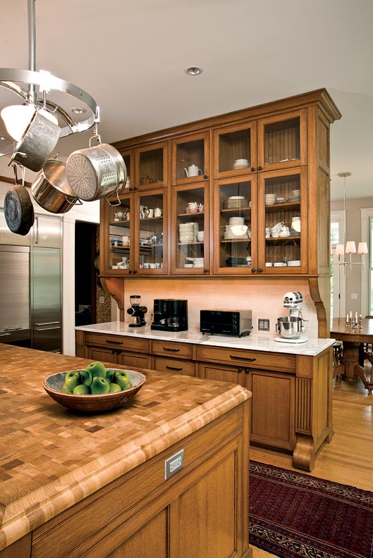
To create a design for the kitchen cabinets, the architects asked the homeowners to show them their favorite pieces of furniture. Thus, an Eastlake sideboard became the inspiration for the cabinets. “The starting point was a serving piece in their dining room, which had a grooved horizontal detail on the drawers,” says Stuart. Nina appreciated this tailored approach. “Not only is it custom, but it’s custom for you, reflecting other things that you like in life, so it feels very comfortable,” she says.
Because counter space was at a premium in the old kitchen, Nina and Russell wanted an island; Nina requested that it have a butcher block countertop to make preparing meals easier. Stuart and Julie selected an end-grain wood in a checkerboard pattern and softened it with a profiled edge. “The island gives the whole kitchen a good presence,” Julie says.
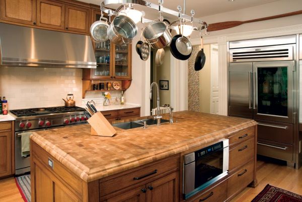
The kitchen’s center island is softened by a butcher block top with profiled edges.
Andy Olenick
Beyond the island stands a custom oversized hutch. “One challenge was how to divide the kitchen and family room, bring in light, and have it feel contained while making it feel like one space,” says Julie. “We designed a really big hutch element that divides the two spaces.” The piece’s traditional lines help it to blend in. “Nina and Russell love their house, and wanted the work to look like it went with the house,” says Stuart.
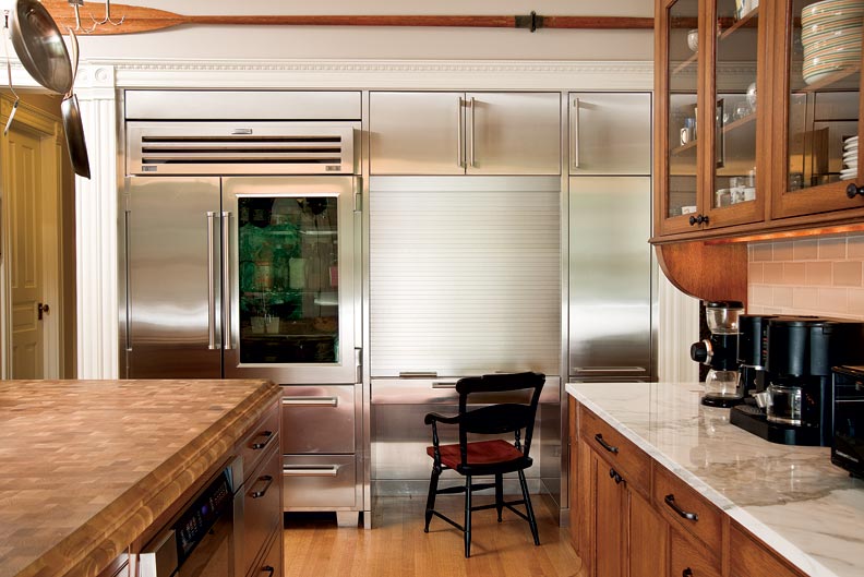
Because the double house has no windows along its communal wall, the architects also created a bank of stainless steel—refrigerators and a built-in desk with a tambour door—to help brighten up the space. (As an added bonus, the desk’s roll-down closure helps to hide work clutter.)
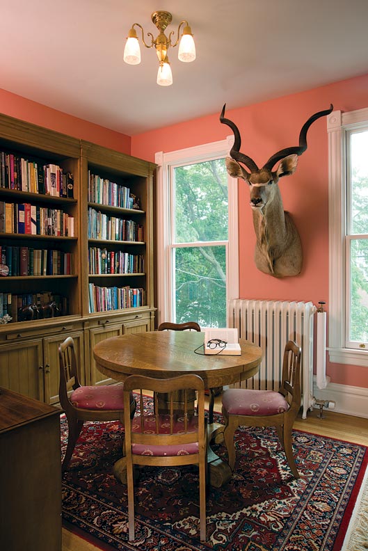
Stuart and Julie also removed the spiral stairs, replacing them with a more traditional staircase along the wall, and restored the ceiling in the family room, effectively creating a new room—a library—upstairs in what used to be the stair landing. Nina and Russell greatly enjoy these reworked spaces. “The kitchen and family room—which used to be the coldest rooms in the house, prior to restoring the ceiling—are now where I spend a great deal of time,” says Russell.
Master Plans
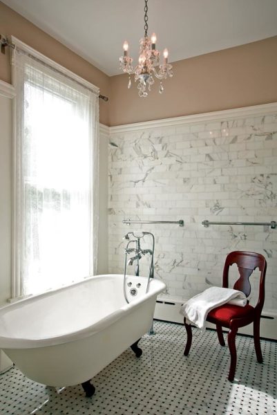
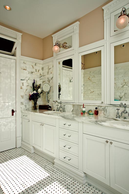
The clawfoot tub is original to the house, its feet painted to match the accent in the basketweave floor. Marble wall tiles add to the luxurious feel.
Andy Olenick
Turning attention to the master bathroom, the design plans aimed for a spacious feel. “Julie and Stuart spent a lot of time making sure the master bath felt big enough,” says Nina. Reusing an original clawfoot tub from one of the kids’ bathrooms was a no-brainer. “There’s a curving bay that sort of sticks out on the front of the house, and we thought that was a natural for a freestanding tub,” says Julie. “When Julie and Stuart showed us the drawings for the bathroom, we knew the old tub would stay,” adds Russell.
Other tricks that make the master bath feel luxurious include a backsplash of Calcutta gold marble, and some fancy trimwork that re-created the door’s transom window out of mirrors above the sinks. Recessed toe kicks on the vanity make it easy to stand close to the sinks, and also impart the sense of quality built-in furnishings. Drawers are accented by glass pulls. “Once the cabinetry is in place, we bring out a selection of hardware to show our clients the scale so they can see what will actually work,” says Stuart.
Vintage lights, mounted on the mirrored “transoms,” add vintage charm and were scored by Nina at a favorite local store. A marble basketweave floor also adds a rich visual texture and helps break down the scale of the room.
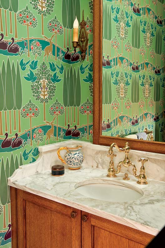
For Stuart and Julie, scale is something to be manipulated. Downstairs in the powder room, a thoughtfully designed vanity topped by a to-the-ceiling mirror makes a tiny bathroom feel bigger. “It was so small and claustrophobic before; now it seems luxurious,” says Nina.
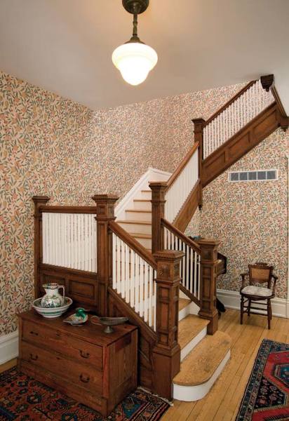
Stripping layers of paint restored original details to the main stairwell, while the William Morris wallpaper helps unify the towering space.
Andy Olenick
The main stairs were another area of consultation. While no design changes were needed, Stuart and Julie encouraged bringing the woodwork back to its natural finish and adding a period-inspired wallpaper. Nina settled on a William Morris print from 1885, “Fruit or Pomegranate.” Stuart advised continuing it through the first part of the hallway, where it naturally stops at an archway. “The design of the paper makes corners fade away, and you feel transported to a different place, like in Where the Wild Things Are,” says Nina.
In the end, the project—which won an award for best sensitive addition/alteration from the city of Evanston—is one that everyone feels proud of. “Nina just loves her house, and when we were painting and re-plastering, she was adamant about keeping the bumps and the character of the house. She wanted it to have a patina,” says Julie. The house succeeds at masterfully blending old and new.
For Russell, the project was a success on many levels. “My goal was to create a space that made me smile every time I walked in,” he says. “I also like knowing that we have helped maintain a beautiful house so it can be passed on to the next owner, whenever that happens to be.”