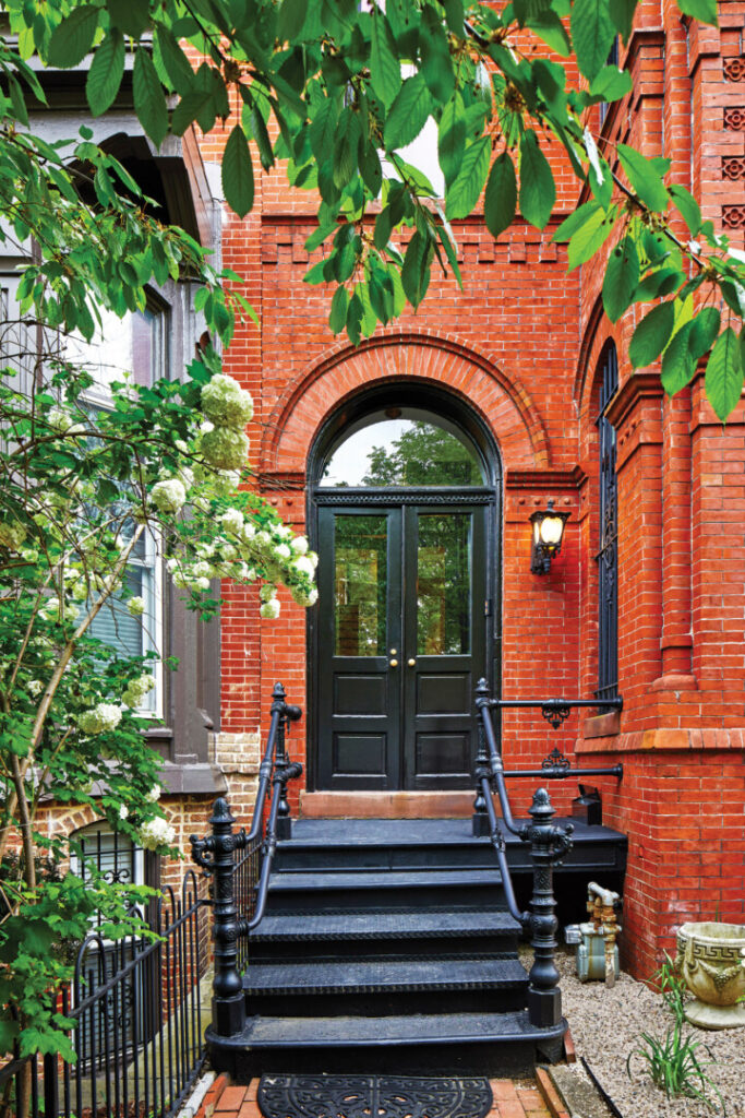
Anyone walking into this 8th Street NW row house, in the Shaw Historic District of Washington, D.C., might think the 1888 building was a preserved original, now restored to reveal all its details. They would be wrong. With few exceptions, architectural elements are new. Owing to the work the firm has done on other area row houses, Hill & Hurtt Architects was hired to reconstitute the badly altered interior and neglected exterior of the historic building. “The house had been the victim of many ad-hoc additions over the years,” says principal Joshua Hill. “There were issues to resolve.” Additionally, as in many homes of the period, it presented a warren of small, walled-off rooms—a floor plan at odds with the homeowners’ contemporary lifestyle.
Stacy Zarin Goldberg
Hill & Hurtt Architects’ approach to the whole-house renovation was to prioritize three objectives: bring light deep into the house with more windows, a new skylight, and enlarged cased openings between rooms; use reclaimed, sustainably sourced, and energy-efficient materials and systems; and develop an “architectural language” to echo the Victorian period while creating spatial definition.
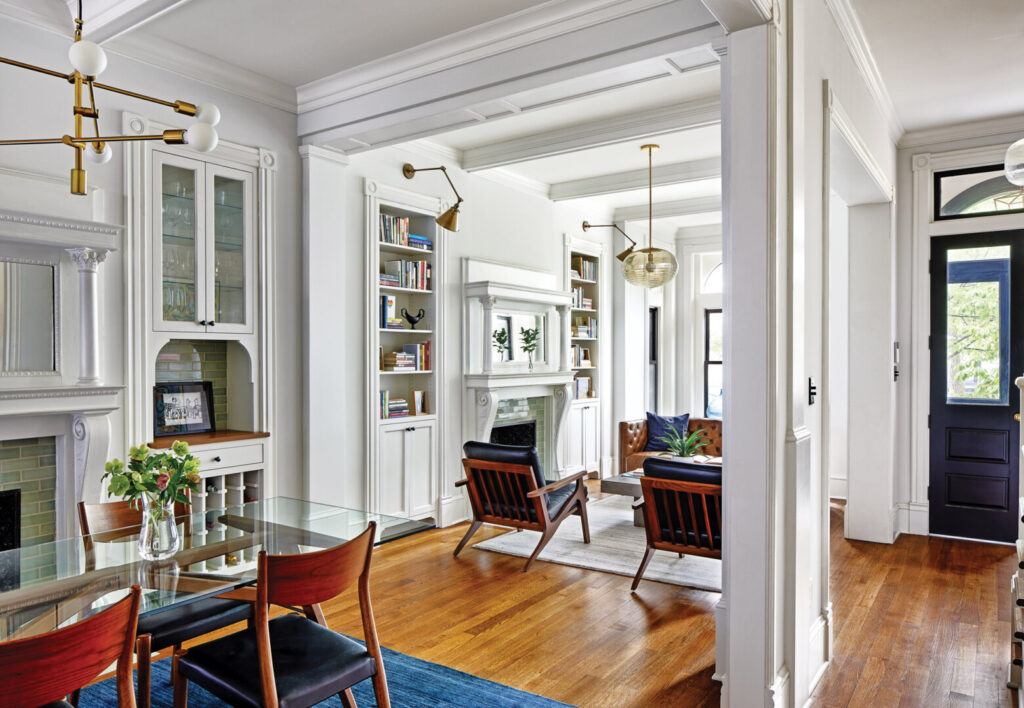
From the entry vestibule through to the living room, dining room, and kitchen, the rooms were generally appropriately located for modern living. The one incongruent room was the powder room, directly off the kitchen. Moreover, a rear service stair robbed space from the kitchen and therefore was removed. Taking out the powder room and back stair, and widening the existing openings between the first-floor rooms, did much to improve the flow and feel of the floor plan.
Stacy Zarin Goldberg
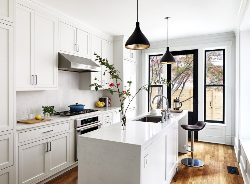
Style-wise, the transition from entry to kitchen moves from traditional to contemporary. “Kitchens and bathrooms in really old houses are interesting spaces,” Hill notes. “With perhaps one exception, no client has ever asked us to redo their kitchen to look just as it did in the 1800s. Nobody wants that.” Here, custom-painted wood cabinets with an inset flat panel lend a traditional detail; yet the sticking is beveled, not ornate like a raised panel, and the casing and crown have simple profiles. “We thought that worked with the appliances and with the quartz backsplash and waterfall countertop—it was another way to thread together a 2020 kitchen in an 1888 house.” Even though the kitchen is a small room that faces a neighbor’s brick wall just five feet away, the light that comes in is soft and muted and helps make the space feel more spacious.
Stacy Zarin Goldberg
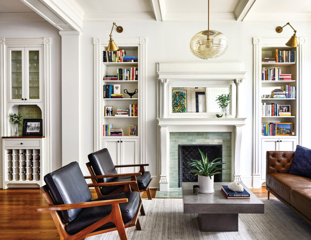
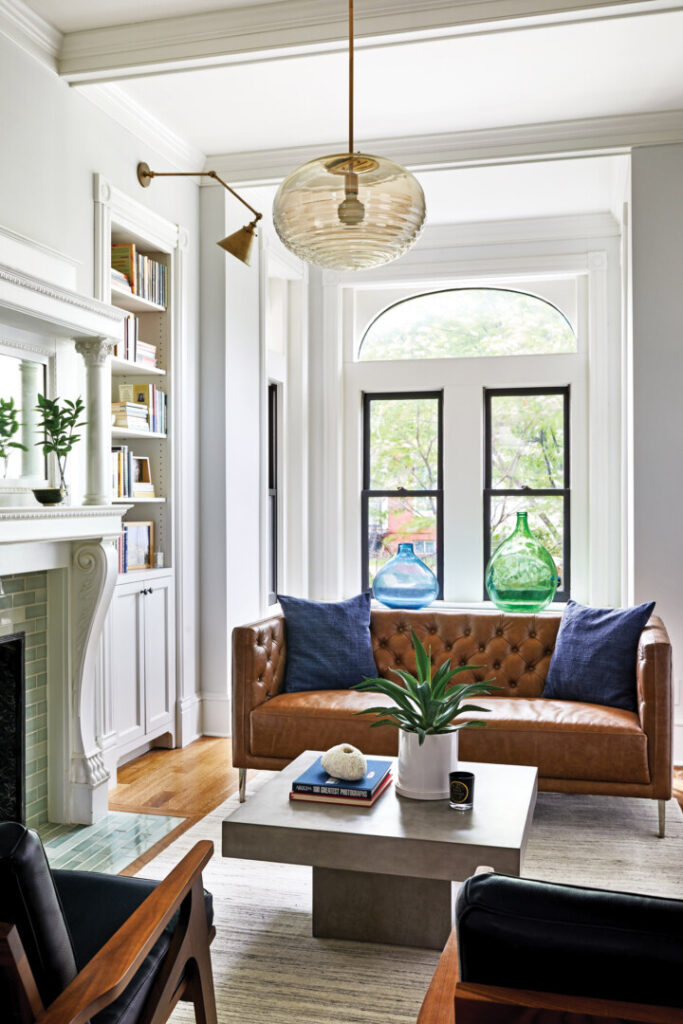
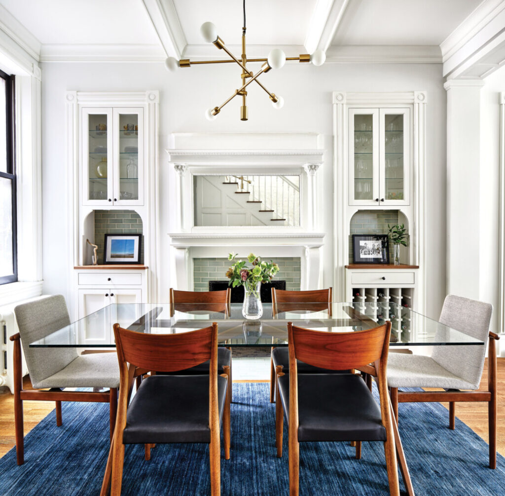
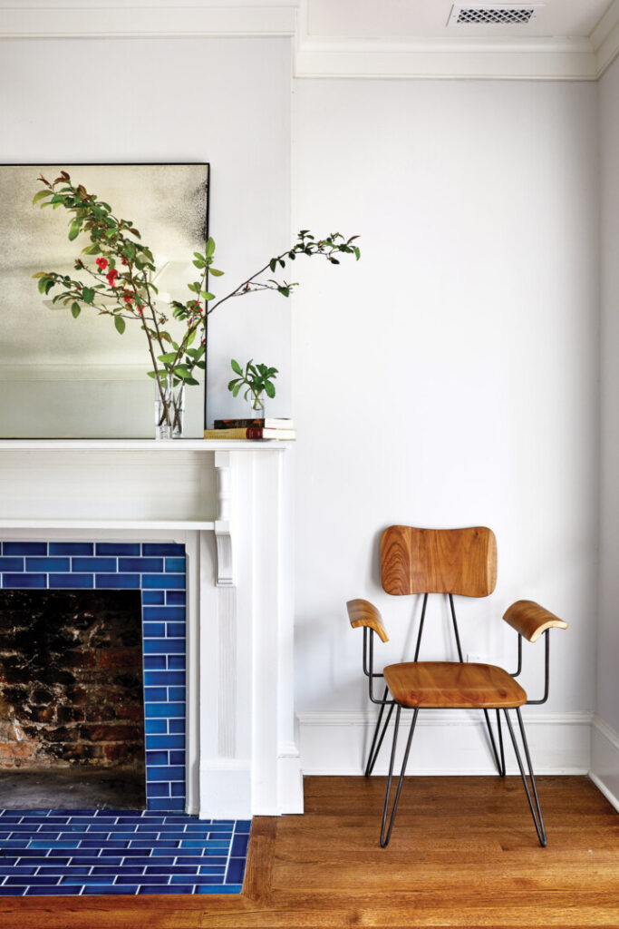
Both fireplace surrounds—in the front room and in the dining room—had been removed and replaced, one with stone glued directly to the wall and the other with wood. The only original components were the metal fireboxes. The mantelpieces that Hill & Hurtt introduced were salvaged from a row house in Baltimore. Although it wasn’t important that they match, as luck would have it, Hill was able to find two with decorative, carved claws on the pedestals. He describes them as “very D.C. row house,” and notes that they look as if they have been here since the house was built.
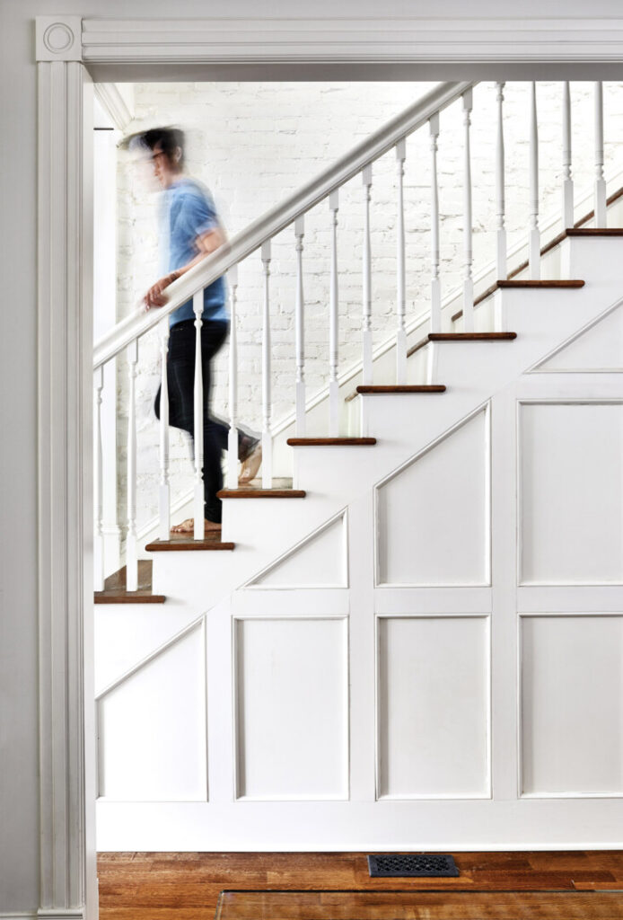
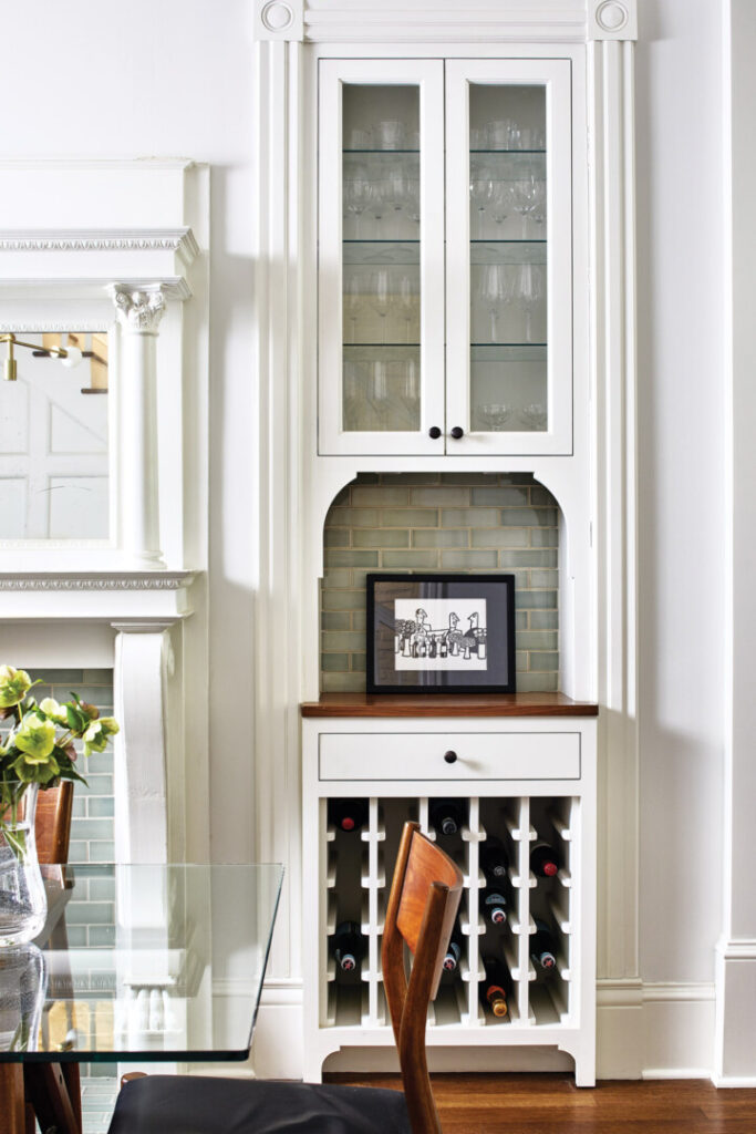
Beyond the fireboxes, the newels were the only other original detail. Everything else is new—from floorboards to trim to built-ins. New stair balusters were fabricated based on those from a house of the same period, which the firm was working on simultaneously. The panels on the stair are another example of a missing detail replaced. Others include the casings, ceiling beams, and the pilaster between the front room and dining room, which keeps the rooms open while demarcating them. “There are ways to relate to original details without copying them exactly,” Hill says. “That’s the idea behind the kitchen with the large windows and door—they work even though they never would have been there when the house was built.”
Stacy Zarin Goldberg
Upstairs, renovation was a little more invasive, in terms of changes to the floor plan. Previous remodeling projects had eliminated any trace of the original layout; they included an L-shaped master bedroom with a soaking tub—in the room. The design team cleared the slate, adding two generous bedrooms and two bathrooms.
Stacy Zarin Goldberg
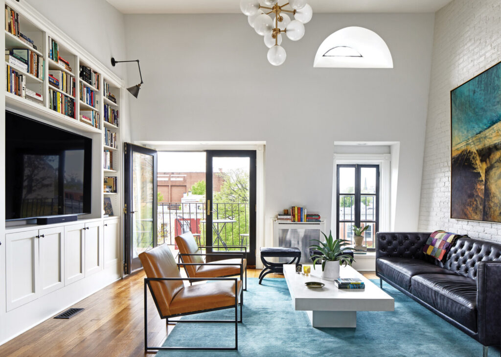
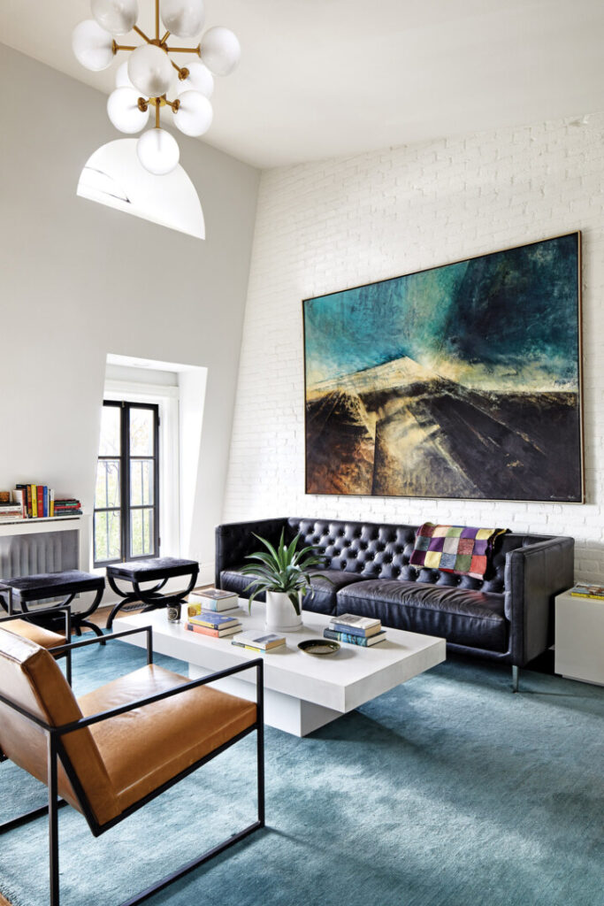
The top floor, its previous access an unsafe stair without a railing, held a sprawling and ill-defined common room with a kitchenette. It was transformed to be “a more discrete space,” with a vaulted ceiling. The kitchenette was replaced with a full bath, and a 10-foot-tall, built-in bookcase now distinguishes the space, exemplifying the level of craftsmanship throughout. Legally, the third floor counts as a bedroom, but it is used as a family room—in fact, it is the most-used room in the home. A particularly significant change on the third floor was the introduction of a skylight, which brightens even the second floor. “You have to wear sunglasses and put on your sunscreen when you get up there,” Hill jokes.
Stacy Zarin Goldberg
Considerable restoration work was performed on the front elevation. Workers were able to peel back the layers on the old windows to reveal the original brickmould casing. New windows were installed into existing openings from the interior to retain the casing. “It’s not impossible to replicate such details, but it is always nice when you can use the original components,” Hill notes.
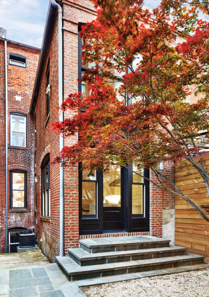
Changes made to the back elevation are noteworthy. “We treated it almost like a block of cheese, cutting out a strip in the center to infill with windows and a new door,” explains Hill. The original brick detailing and ganged double-hung windows informed the new work, as did the height of traditional row houses: Using tall, narrow windows and an eight-foot, six-inch-tall door is a design decision that relates back to Victorian architecture.
Stacy Zarin Goldberg
At the rear, the idea was to enhance the indoor/outdoor connection while honoring the brickwork, corbeling, and archways that characterize the period’s architecture. To accommodate the kitchen layout desired—which would feature a free-floating island and a full counter on one wall—the glazing needed to be shifted off center. To accomplish that, the wall’s width was built out by a one-brick dimension, or four inches. “The treatment on the rear elevation feels like an inset piece—as opposed to the front façade’s smaller elements that add up to create the composition,” Hill says.
Stacy Zarin Goldberg
“On the back, the inset is the defining element. It’s pretty to look at, and it’s pretty to look in—which, when the house was built, certainly was not the case.”
Stacy Zarin Goldberg
More details worth a mention include a cedar-clad, open-air carport bay with a gate into the rear garden. It keeps the courtyard free from a view of the car, enhancing the outdoor experience. Also, pushbutton light switches throughout the house provide a tactile experience that recalls an earlier time—something the homeowners were keen on.
Stacy Zarin Goldberg
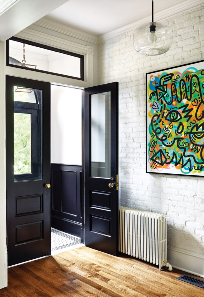
At the start of this project, the clients were unsure of what they wanted. As things progressed, they developed a firmer sense of their personal aesthetic, as informed by Hill & Hurtt’s work. “They liked the character of projects we were showing them,” Hill says, “but their house didn’t have those same original features.” They’d intially fallen in love with the exposed-brick wall in the entry hall, but later questioned its place in the renovation plans. Presented with the idea of painting the brick white, then continuing on with a white-and-black theme, the owners were thrilled by the prospect of holding onto a beloved feature even as the house was revamped. At every turn, that’s what this project was about: looking for what was worthy of reimagining.
Stacy Zarin Goldberg
Stacy Zarin Goldberg
Stacy Zarin Goldberg
Stacy Zarin Goldberg