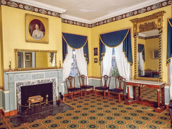
The redecoration of Boston’s Otis House parlors was a revelation.
Courtesy Historic New England
Muted is not the word to describe late-Georgian through Federal era colors, says color historian John Crosby Freeman. He points to the parlor at Boston’s 1796 Otis House, headquarters of Historic New England. The redecorating project during the 1970s was revolutionary in its scholarship, returning to the room strong clear yellow and Wedgwood blue—as well as a paper border with a black ground, and orange accents framing fully colored landscape scenes. The carpeting, laid wall to wall, is a graphic pattern in red, gold, and deep green. All of it is based on period evidence.
A common misconception is that the color palette consisted of white, bisque, and grey. In fact, the diverse colors of the period range from strong, greyed-ochre shades and verdigris to brilliant salmon (a Federal period favorite), orange, violet, and brown. Gilding, often used with black accents, was popular on mirrors and lighting devices.
The porcelain colors created by Josiah Wedgwood—not only blue but also green, lilac, and yellow—defined elegant formal interiors in the cities. The Neoclassical architect Robert Adam introduced delicate cucumber green. Pastel rooms arrived during the Federal era.
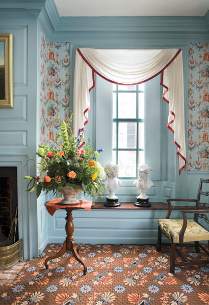
The ca. 1800 French paper, now ‘Votive Goddess Arabesque’, was reproduced by Adelphi from the original document found in the front rooms of this 1777 sea-captain’s home in Newburyport, Mass.
Eric Roth
Readily available to the middle class by this period, wallpaper was fanciful, often printed in geometric or exaggerated designs. The three-dimensionality of Georgian-era patterns survived into the Federal period, as did strong color, but colors became clearer and brighter. Popular papers simulated brickwork or hewn stone (ashlar). Like the era’s grain painting, patterns could be whimsical: swirling designs were added to ashlar, and blue or red scrollwork decorated the “mortar” between blocks. Both stripes and diaper patterns (diamond shapes with diagonal repeats) were popular, as were flocked damasks. Ombré or irisé papers gave a rainbow effect.
After 1790, more open designs took hold, including swag and drapery motifs as well as French arabesques, or columns of repetitive motifs. Borders echoed changing tastes, often taking cues from Greek key or egg-and-dart motifs, dentils, swags, ribbons, and festoons. Color preferences, pattern scale, and pictorial characteristics changed from the Georgian to the Federal periods, but themes were continually reinvented. For instance, floral patterns were always popular—from damasks to the flower sprigs, vines, and naturalistic French blooms that became popular after the American Revolution. Paper was rarely used on ceilings during this period.
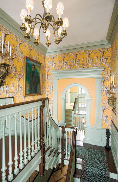
Adelphi’s ‘1776’ is a pillar-and-arch paper dating to about 1790.
While the floors in entry halls were typically painted, emulating fine woods or a black-and-white marble checkerboard, main rooms were carpeted from wall to wall, often with Venetian carpet (a striped flat weave), or Brussels (with a loop pile). The era’s carpet patterns, like the wallpapers, are strongly graphic and color-rich.
Freeman goes so far as to say that the “fashionable colors of late Colonial and Federal interiors were the freshest and most original palettes seen in America until the Jazz Age of the late 1920s.”
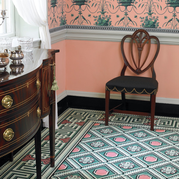
In an 1803 country manse, original colors were determined by extensive paint analysis. ‘Claverack Coffer’ is the reproduction Brussels carpet, from J.R. Burrows.
Gridley + Graves
Georgian & Federal Color Palettes
The following collections offer colors that closely match early paint colors, as well as revival versions.
• Benjamin Moore ‘Historic Color Collection’, interior/exterior
• Farrow & Ball Traditional colors & finishes
• Fine Paints of Europe ‘Mount Vernon Estate of Colours’
• ‘Historic Colors of America’ Historical colors authorized by Historic New England
• Homestead House Paint Co. Traditional finishes, historical colors in milk, acrylic, and oil paints
• Olde Century Colors ‘Simulated Milk Paint’ & modern formulations in traditional colors
• Old Fashioned Milk Paint Co. ‘Authentic Colors’
• Old Village Paint Colonial, Federal & Victorian colors in multiple formulations
• Pratt & Lambert ‘Color Guide for Historical Homes’
• Real Milk Paint Co. ‘Traditional Blends’
• Sherwin-Williams ‘Preservation Palette’
• Valspar ‘Traditional Heritage’, ‘Belle Grove,’ and ‘Woodlawn’ collections


