
All things being equal, a wall painted green will create an ambiance and evoke a response that’s different from the same wall painted orange. But all things are rarely equal. A given hue is tempered by its value (dark to light), tone (degree of grey), and chroma (saturation or intensity). Color is affected by the room’s degree of sunlight; by contrasting and adjacent colors; and even by personal associations. As we saw in the Chinaberry-color kitchen, a saturated “hot” hue acts as a neutral when it’s used on most of the surfaces in a modest-size space.
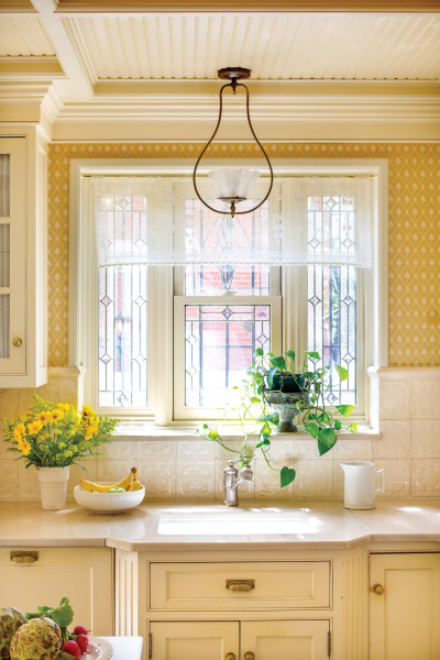
A sunny ivory-and-yellow kitchen is clean, light-filled, and warm in this Victorian brownstone house. (Designed by Paul J. Somerville, pjsomervilledesign.com)
Gross & Daley Photography
Nevertheless, the theory of color psychology has been around for a long, long time, and explains why kindergarten rooms are decorated in orange and hospital halls are green. Certainly, neuroscience supports much of it. Here’s a list of the primary and secondary colors and rooms in which they may work best.
BLUE
It’s the color of sky and ocean. Peaceful and tranquil, blue causes the body to produce increased levels of neurotransmitters (such as GABA), which helps us focus and relax. Blue is good for bedrooms, reading nooks, and studies.
GREEN
Green is the dominant color of nature, so it’s not surprising that the human eye is most sensitive to it. Did you know we can see more tones and shades of green than any other color? That was evolutionarily important. Green is calming, restful, and healing, so it works well in bedrooms and living rooms.
YELLOW
Yellow is a color of energy. It stimulates the intellect. It’s good for cool, north-facing rooms that need to be warmed. It also speeds human metabolism and so has long been used in kitchens and dining rooms. But beware: Yellow is not restful, and may enhance feelings of emotional distress. It’s not a good choice for a quiet study or a bedroom. Studies have shown that people tend to lose their tempers, and babies cry more, in yellow rooms.
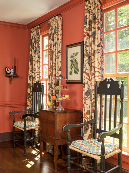
Used in the dining room of a 1949 Royal Barry Wills Colonial Revival house, the historic salmon-red wall color feels surprisingly contemporary.
Gridley + Graves
ORANGE
Orange conjures warmth and energy, bringing memories of fall leaves and pumpkins. Orange aids digestion and thus is a good color for kitchens and pantries as well as dining rooms.
RED
Red is the most intense color emotionally; it stimulates heartbeat and respiration. Red is the color of love and passion; it attracts attention immediately. It’s a sociable color, and it stimulates the appetite. Red works well in dining rooms, kitchens, and libraries.
See A Queen Anne Revival Kitchen for a striking kitchen color choice!
PURPLE
An expensive color to make, purple was long associated with royalty and luxury. Today, purple accents add sophistication. Mixing the calming influence of blue and the intensity of red, purple stimulates creativity and wisdom, and is often used in academic institutions.