A modern bath exhibited at the Metropolitan Museum of Art in 1929 showcased black Kohler fixtures in all-the-rage Deco—the distinctive lines of which are seen in this lavender and green inset tub from the same year.
Linda Svendsen
Books and products mentioned in oldhouseonline stories are chosen by our editors. When you buy through links on this site, we may earn an affiliate commission.
Pure white—the color scheme of early 20th century bathrooms—was uniform, blindly bright, and based on the Victorian-era notion that germs lived in dirt. Logic then dictated that dirt would show up best against a solid white backdrop, so snowy floors, walls, and fixtures made the dreaded filth easier to identify and conquer. Magazines of the day touted the importance of the hospital-white bath, considered a sanitary ideal, and homemakers took pride in making these spaces gleam. Still, it only took a couple of decades before the pull of fashion and a push from modern advertising transformed residential bathrooms into places that were blooming with color. While often garish-looking to 21st-century eyes, these colorful spaces were the height of fashion in their day and are easier to appreciate once you understand how they came to be.
It’s hard to pinpoint the exact date things started to change. Bathrooms didn’t transform overnight; it took some time for color to take hold across the country. But we do know that as early as 1927, companies like Kohler and Universal Sanitary Manufacturing had begun producing bathroom sinks, tubs, and toilets in vibrant colors; Crane and Standard Sanitary Manufacturing Co. (now American Standard) quickly followed. What drove the trend? “I think it really was the fact that a company the size of American Standard was able to color match all the pieces. We weren’t just making one or the other [a sink or a tub]; we were making all of the components,” says Gray Uhl, American Standard’s director of design. These perfectly matching sets, of course, were instantly appealing to consumers. Perhaps not so coincidentally, the incidence of color advertising was on the rise too. More color and improved sophistication in print advertisements and mass marketing created demand for all sorts of consumer goods previously not thought about or discussed, bathroom fixtures among them.
Rose du Barry was one of nine colors in American Standard’s rainbow repertoire, first introduced in 1929.
The Warshaw Collection of Business Americana-Plumbing, Archives Center, National Museum of American History, Smithsonian Institution
For the first time, the bathroom was seen as its own design domain within a house. In their book The Bathroom the Kitchen and the Aesthetics of Waste, Ellen Lupton and J. Abbott Miller explain, “The bathroom, formerly positioned as a kind of hospital-within-the-home, was now being re-absorbed into the fabric of the house, subject to the same decorative attention as other rooms.” Once again, popular magazines played a role in spreading the latest thinking. “The stringent norms of the bathroom,” note Lupton and Miller, “were called into question, not on the grounds of cleanliness, but on the grounds of style. If the bathroom’s cleanliness reflected the housewife’s standards of hygiene, then its decoration, or lack of it, reflected her taste.” Soon manufacturers launched ad campaigns to sell consumers on the idea that clean and stylish could go hand-in-hand. In 1929, an American Standard brochure put it this way, “Those who have always thought of white as the color that best expresses cleanliness will find that Royal Copenhagen blue does it equally well and, in addition, permits color combinations that have greater individuality.”
Historic Proportions
Other factors almost certainly played a role in the color-in-baths phenomenon. The popularity of Art Deco was one-reaching the United States in the late 1920s and bringing waves of bright colors in packaging and posters. The early impact of Hollywood is another, especially Cecil B. DeMille movies, famous for their lavish and lingering bath scenes, which were increasingly seen in fledgling color processes. Remember, too, that the 1920s saw the peak of an unprecedented building boom; what may have started as a strategy to stand apart from competitors in a hot marketplace likely assumed new significance for manufacturers clinging to a lifeline after the Great Depression hit.
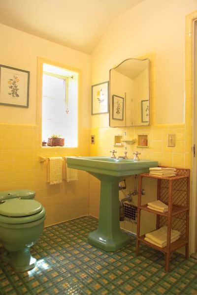
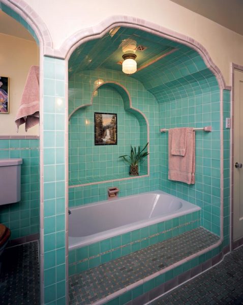
Yellow and green were a fairly common combination, but the floor is a showstopper. The unusual pattern was created by the homeowner, who implemented many fashion trends during her home’s construction in 1932.
Andy Olenick
By 1930, it seems color in bathrooms was in the promotional spotlight everywhere. “Color has come to the bathroom in its fullest glory and appealing charm and is steadily growing in popularity,” heralded the 1929 Home Builders Catalog, a resource book for people planning the construction of their own home. Sanitaryware manufacturers took out full-page ads in architectural forums, selling the idea that the popularity of new housing developments depended upon their use of colorful sinks, tubs, and toilets. “During the past year we have used colored enamelware and vitreous china fixtures exclusively in our bathrooms,” professed a Philadelphia architect in one such Kohler ad published in 1930. “These have been accepted with the greatest enthusiasm by an exacting public.”
Targeting yet another audience—landlords—an American Standard ad from a May 1930 issue of the Saturday Evening Post Magazine boasts a bathroom outfitted with pink fixtures, pale green walls, black floors, and a headline that screams, “Modernize the plumbing—hold your tenants!” Remarkably, the color-in-bathroom trend even reached the floor of the Metropolitan Museum of Art. In a 1929 display, the museum showcased an “Exhibition of a modern bath and dressing room”—a Deco-inspired onyx, pink, and sable suite designed by the prominent New York architect Ely Jacques Kahn, showcasing black Kohler fixtures outfitted with chrome accessories.
Colorful Times
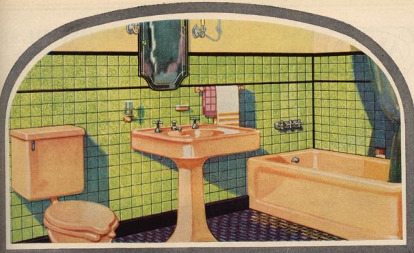
Horizontal bands of dark color, which were believed to make small rooms appear larger, can still be seen in many a period bath, attesting to the enduring popularity of this design wisdom.
Home Builders Catalog, 1929/Panelstone
Once the public decided to take the plunge into color, they went all the way, often splashing walls, floors, and fixtures with different, vibrant tones. Tiles, paints, curtains—even furniture and throw rugs—all appeared in bold hues. The earliest American Standard brochures to sell bathroom essentials in color featured a wheel of complimentary shades behind each one, a brilliant marketing ploy to help consumers coordinate floors, walls, and accessories to match. Suggesting four-color combinations like red, black, green, and gold, these palettes were not for the faint of heart.
It’s interesting to note the names manufacturers chose to give these early colors. They seem intent on evoking either the exotic (Ming Green, T’Ang Red), the ethereal (Horizon Blue), or the historical (West Point Gray, St. Porchaire Brown), perhaps evidence of just how integral the advertising industry was becoming to manufacturers’ marketing techniques.
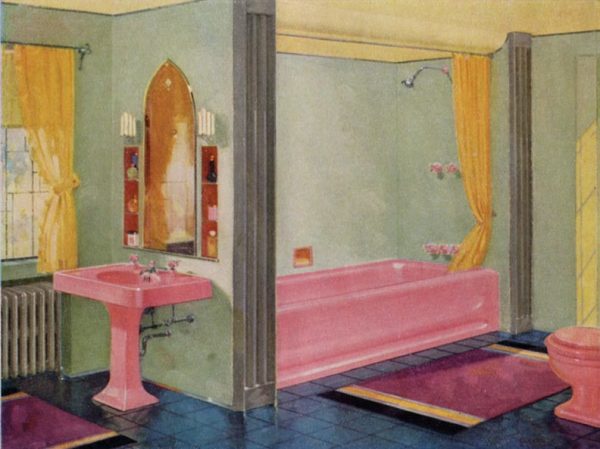
Pink was a popular 1930s color choice, especially when combined with black or gray; this 1932 pairing with blue is a bit more unusual.
Andy Olenick
Sink and toilet brochures also included insights and advice for designing the perfect bath. Ever wonder why so many bathrooms from the 1930s onwards feature a border of black tiles? Maybe this design hint, from the pages of an American Standard brochure, offers a clue: “If you desire the effect of size, horizontal bands of color around the walls will give it to you.” Another suggestion for enhancing room size was to place the darkest colors on the floor, using lighter ones as you decorated up and around the room.
So what were some of the other color combinations? Well, they ran the gamut from Easter egg aggregations of pastel pink, green, yellow, and blue, to Deco-inspired looks positing black with bright pink, blue, or green, to seemingly incongruous match-ups like green and purple. Then there was the all-out crazy: burgundy and grey, pink and purple, tan with blue and brown. It seems Anything Goes was more than just a popular 1930s musical; it was also the new mantra for bathroom décor.
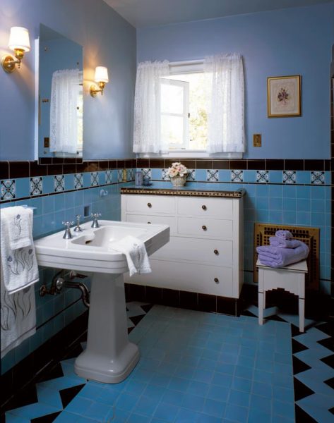
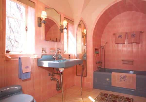
Folks who couldn’t commit to colored fixtures could still splash it everywhere else, as the tile in this 1829 house shows.
Linda Svendsen
While the popularity of color fixtures continued well into the 1950s, the shades offered for sale went in and out of fashion. Black is a good example; prominently featured in the sink and tub of that 1929 Metropolitan Museum display, Kohler was no longer offering black fixtures just a decade later. The colors-of-the-moment may have come and gone, but one thing remained a constant: The shift in thinking that brought the first blush of color to lavatories in the late 1920s changed the way we’ve looked at bathrooms ever since, paving the way for the explosion of colorful, creative, Anything Goes designs still in vogue today.