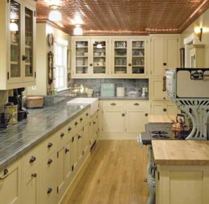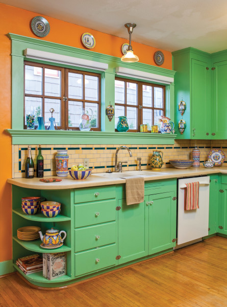
A fearless use of period colors is evident in the kitchen of the 1906 house.
William Wright
This kitchen is in a 1906 Craftsman house in the northeast Portland neighborhood of Irvington. The house had suffered neglect. Windows were hidden behind layers of vinyl “lace” that had mildewed; pulling the panels aside revealed broken panes covered with cereal-box cardboard. The kitchen had gotten a cheap update. But: Original tongue-and-groove paneling was visible behind peeling wallpaper in the breakfast room. In other rooms, original woodwork of Douglas fir had not been painted, though the varnish had darkened.
Once the basics were finished, the fun projects began. In the breakfast room, wainscot in a composition material was removed to reveal beadboard walls and ceiling. In the kitchen, original cabinets and marble-aggregate countertops were intact on one wall and became templates for restoration. A period-appropriate backsplash replaced black and white tiles added later. New countertops are Caesarstone, an easy-to-maintain quartz aggregate. New maple strip flooring replicates the lost original, and is top-nailed in period fashion.
The sunny colors of Italian pottery cued paint colors in the house. These homeowners have long collected colorful majolica from Deruta in Umbria and Siena in Tuscany.
1. SAVING WHAT’S ORIGINAL
In the breakfast room, composition wainscoting covered in seven layers of peeling paper was torn away to reveal the century-old tongue-and-groove boards on walls and ceiling. Original casement windows found in the basement replaced deteriorated aluminum sliders.
2. PERIOD COLORS ANEW
Orange-tone walls and fern-green cabinets wear period colors cued by the Italian and French pottery. Maple strip flooring replicating the original (damaged in a 1920s woodstove fire) is a subtle reflection of the bright walls.
3. SIMPLE TILE TIE-IN
Dashes of color, including a pickup of the orange tone, distinguish the subway tile, which was ubiquitous in turn-of-the-century kitchens. Backsplash tile by Pratt & Larson replaced incongruous black and white tiles.
4. EVERY DETAIL
Cabinets work because they’re based on a wall of originals found intact in this kitchen. Wood trim matches the 1906 date of the house. Rounded shelves at the end of the run are both practical and recall 1920s–30s updates to the house.
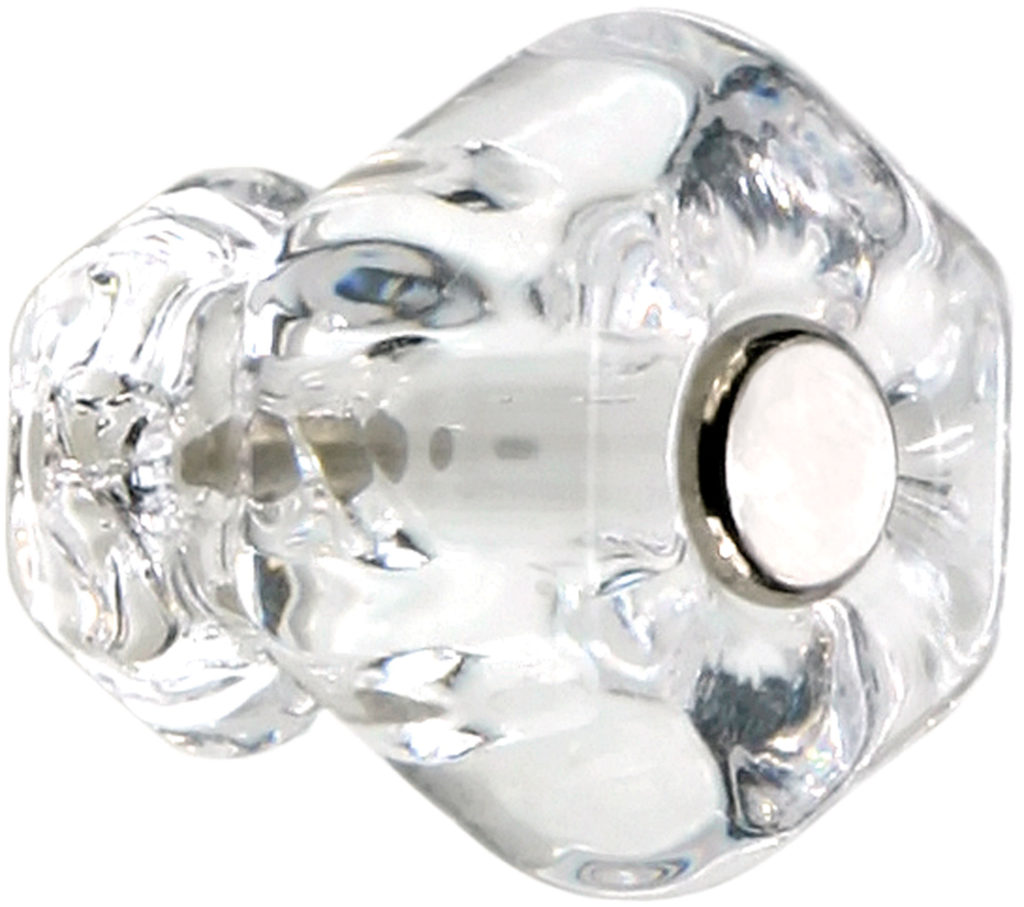
Ca. 1900–1940, the hexagonal glass cabinet knob and matching bridge pull were favorites. Find them in clear and 14 colors. The 1 ” knob is standard; other sizes offered. The pull is 3″ on center. Bolt(s) included. houseofantiquehardware.com
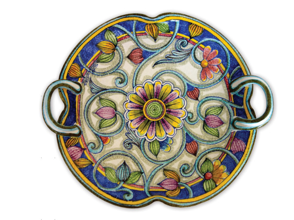
Italian pottery.
Tuscan Designs is a fabulous import store in Rockport, Mass., which also sells Italian pottery and other items online. Handmade and hand-painted ceramics, in both very traditional and fun contemporary designs, hail from Deruta, Siena, Montelupo, Orvieto, etc. The Fiori Collection centerpiece bowl with handles is 14″. tuscan-designs.com
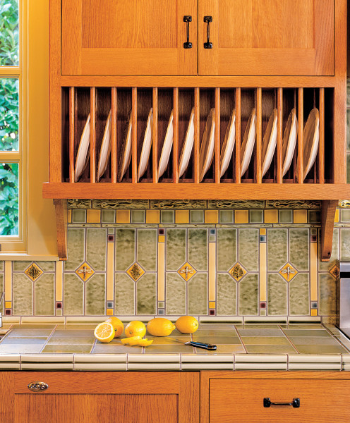
Kitchen tile installation.
Find a gallery of kitchen tile installations on the Pratt & Larson website, including this backsplash in an Arts & Crafts kitchen. Multiple tiles (including the 1″ mosaic) and glaze colors shown, custom pricing. prattandlarson.com
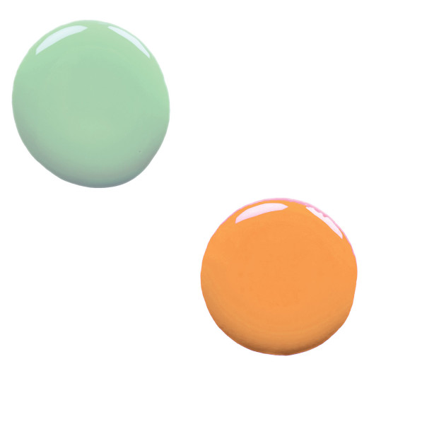
Benjamin Moore paint colors.
These paint colors have zippy names but are right from the first decades of the 20th century. Walls are in Mango Punch 154 and cabinets in Douglas Fern 563. The trim wears Cucumber Salad 562. benjaminmoore.com


