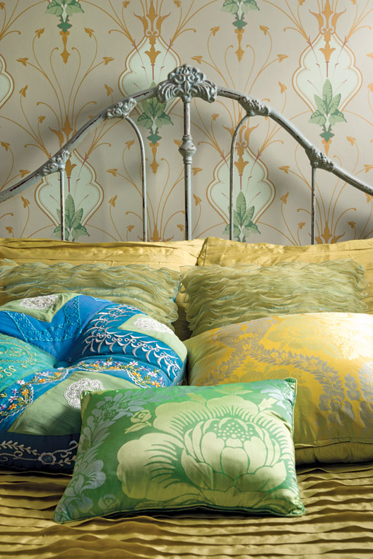
Art Nouveau wallpaper from Switzerland (now discontinued) dresses up a tiny bedroom.
Wallpaper has been around for a couple of millennia. The Chinese decorated interiors with painted sheets of rice paper around 200 B.C.; painted canvas was used during the Middle Ages as a substitute for more costly tapestries on castle walls; and handmade, wood-block prints glued to linen and attached to walls in Elizabethan England offered protection from damp and smoke. But it wasn’t until the English invented a roller machine for printing wallpaper in 1839—just a few years after their repeal of a wallpaper tax—that paper became affordable to the middle class. For the next century, walls and ceilings were covered with papers in both England and the United States.
Machine-printed papers soon dominated the market as costs fell and advances in registration and printing improved their quality, but block-printed papers remained the finest for their individual colors and handcrafted uniqueness of design. The discovery of aniline dyes in 1856 greatly increased the color choices available as well (and they were much healthier than arsenic- and white-lead-based papers).
If your home was built between 1870 and the early part of the 20th century, your wallpaper options are vast. Designs were a mix of styles, with tastemakers such as Owen Jones (whose influential Grammar of Ornament is reprinted today) emphasizing historic authenticity with stylized patterns that often featured Islamic or Moorish motifs. After Commodore Perry’s expedition to Japan in 1853 opened the wonders of the Far East to the Western world, “Anglo-Japanese” style was in vogue, and for the next several decades walls were covered with stylized fans and crescent moons, owls and bats.
The Aesthetic Movement made design a national crusade, and “Art for Art’s Sake” became the motto from California to New York. The period’s decorating bible, Charles Eastlake’s Hints on Household Taste, advised homeowners to divide walls into three sections for more visually appealing rooms: dados on the lower half, fills in the middle, and friezes or borders on top.
Victorian-Era Choices
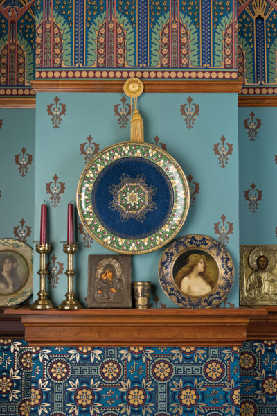
If you own a home built between 1820 and 1860, think classically inspired design: 18th-century rococo swirls and naturalistic, almost three-dimensional flowers (cabbage roses were a favorite), often in vivid greens, pinks, maroons, and reds, were in vogue. Those rich colors weren’t as garish as you might think, as rooms were darker, lit by flickering gas jets. Gothic patterns (pointed arches and trefoils, Tudor roses and heraldic lions) also were popular during this period, with writers such as Sir Walter Scott championing the romance of the Middle Ages. Gothic papers often had an ecclesiastical palette: Primary reds, blues, and golds were a favorite combination of A.W.N. Pugin, the champion of “morally correct” Gothic design.
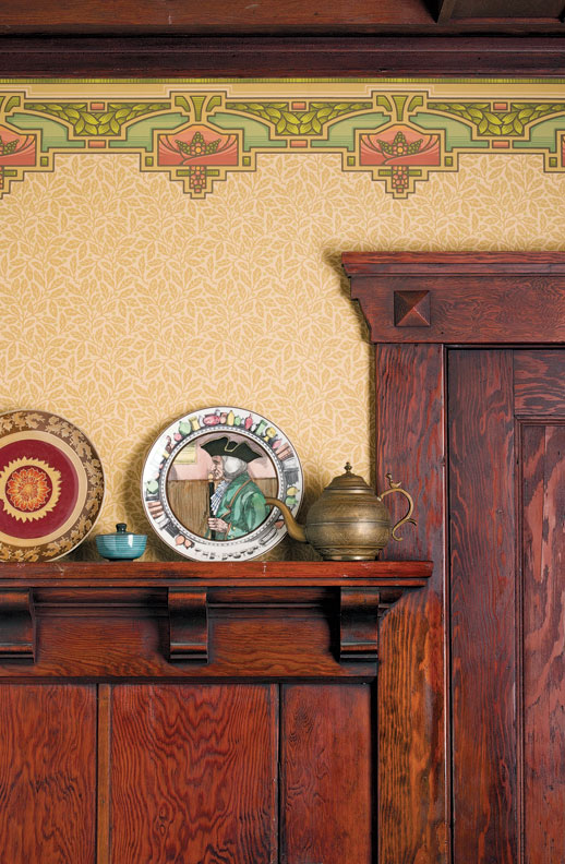
Bradbury’s Arcadia border tops a frieze in a classic Arts & Crafts arrangement.
A room’s location determined the colors and types of papers used. Hallways and passages were meant to be neutral, even somber, so as not to compete with more ornate parlors and dining rooms. Here, trompe-l’oeil marble and stonework patterns were recommended, or perhaps Lincrusta to impersonate tooled leather. Public rooms pulled out all the stops, with every surface from the ceiling down layered with pattern and design in a show of the homeowner’s education and good taste. Bedrooms, baths, and even the nursery also were adorned with decoratively patterned papers.
Analogous colors such as amethyst purple and sapphire blue, or contrasting hues such as hunter green and madder red, would be “pleasingly combined.” Tertiary colors (combined hues producing softer, more subtle tones) also were popular—an olive green paper accented with burgundy and gold, or perhaps a dash of peacock blue fashionably highlighted with terracotta on the woodwork and trim. (The darker colors were not only handsome but practical, too, for hiding dirt and scuff marks).
Arts & Crafts Choices
Walls in the Arts & Crafts era were the opposite of heavily patterned and overlaid Victorian room treatments. Instead, papers bore simplified, honest representations of designs found in nature: flowers, leaves, trees, and animals, which were represented in muted tertiary colors and accompanied by a single frieze.
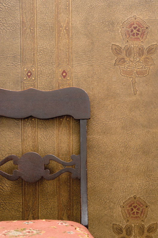
Colonial Revival-era lincrusta, a wallcovering meant to simulate tooled leather.
Papers would have been plainer in a Craftsman home or a bungalow built between 1900 and 1925. William Morris, the founder of the Arts & Crafts movement in England, and Gustav Stickley, chief proponent of the American Craftsman style, both championed “honesty” in design, the importance of hand craftsmanship, and an emphasis on animals and nature: ginkgo leaves, poppies, pine trees, and swallows, with tertiary, “rural” color combinations like forest green and thatch, sienna and ochre.
Decorative dados fell out of fashion as walls were simplified and covered with quieter, two-dimensional patterns, while friezes became broader. Specific themes were recommended for each room: peaceful woodlands for dining rooms, soothing seascapes for baths, and engaging figures for the nursery. And while most of Morris’ papers were advertised for the common man, most were hand-block-printed and only affordable to the wealthy.
Colonial Revival Choices
The 1890s ushered in new thinking, with influential interior designer (and actress) Elsie de Wolfe’s motto, “I believe in plenty of optimism and white paint,” leading the way for the Colonial Revival. A reaction to the excess of the Victorians, interiors were meant to be lightly toned, pretty, and airy, and wallpaper designs returned to classic and French motifs: bows and wreaths, lyres, ribbons, and delicate floral sprays. These classic designs blended well with less cluttered interiors. The wealthy favored scenic papers from France, but those who couldn’t afford a hand-blocked Zuber paper could order an imitation from Sears or Montgomery Ward for a fraction of the price.
Damask patterns were popular through the 1910s and ’20s.
World War I signaled the end of papered walls and ceilings’ popularity. As modernism and International design took hold, unadorned, painted walls replaced earlier polychromed and papered productions. Today’s revival of interest in home restoration has resulted in a wealth of choices for period-appropriate reproduction papers, from densely patterned Victorian to straightforward Arts & Crafts. Keeping the period of your home in mind will help make the decisions much easier.