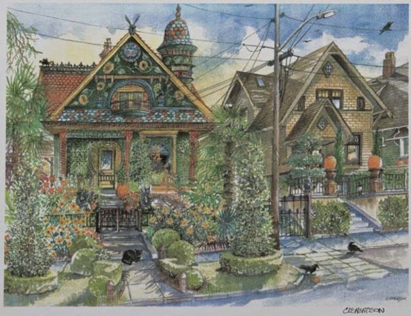
Artist Sarah Yaeger’s rendering of the house, colored with various paint combinations, was integral to selecting the final color scheme.
If you’ve gotten a glimpse of Brian Coleman’s colorful Queen Anne house and matching garden, you’ve probably figured out that such an artful paint scheme didn’t happen overnight. In fact, Coleman went through a pretty tireless process before determining the final paint scheme for his home. (And, he tells us, “We’ve just touched up the paint, repainting the gold and copper balls on the front porch grillework so that it really sparkles when the sun does make an appearance! No house is ever really done, is it?”) Here, he shares with us the four-step process behind his masterpiece:
Step 1: I started my color search by looking through period house color books like Victorian Exterior Decoration: How to Paint Your 19th-Century American House Historically by Roger Moss and Gail Caskey Winkler, and Authentic Color Schemes for Victorian Houses: Comstock’s Modern House Painting, 1883 by E.K. Rossiter and F.A. Wright. I wanted to see what colors were popular in the late 19th and early 20th centuries, and was drawn to the autumnal palate of deep greens, harvest golds, reds, and black.
Step 2: I then had an artist draw a sketch of the house, and we painted it in different fall color combinations—red on the body with green accents, green body with red accents, etc.—until we arrived at the combination I felt worked the best.
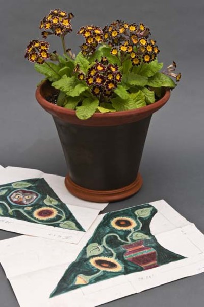
Once the paint colors were chosen, plants for the garden were carefully selected to match.
Step 3: Then the house was painted with oil-based, flat and semi-gloss paints in deep hunter green on the body as a counterpoint to the red roof, with terra cotta, gold, copper, yellow, and black accents. The colors were from Miller Paints, custom-mixed to my approval.
Step 4: Finally, we turned to the garden. Using Mother Nature and the color wheel as our guides, we looked for plants that were complimentary to the colors of the house—deep green, chartreuse, gold, red, and purple were favorites. We avoided pastels and whites, as they were incongruent with the deep tones of the paint scheme. Plant availability changes each year, so it’s always a challenge, but we always return to certain favorites—banana and castor bean plants, bronze-leafed dahlias, abutilon, and of course coleus are a few you can never go wrong with.