In this well-chosen color scheme for a 1940s Tudor Revival, light tan vertical trim boards almost imperceptibly play up the richer body color and red accent on sash.
William Wright
Put down that paint-color fan deck—at least until you’ve stopped to consider the subtleties of your house’s architecture, how the house fits into its surroundings, and the mood you want your color palette to create.
“Choosing color is a time-consuming, thoughtful process,” says Barbara Pierce, the lead color consultant and designer for CJ Hurley Century Arts. “It’s not a decision you make the week before the painters are coming.”
Your choices for color selection and placement should take into consideration not just the body of the house and major and minor trim elements, but also the foundation, the roof, and the presence of such architectural details as corbels and dentils. Fixed contextual elements—which might include the existing foundation and roofing as well as brick, stone, or river-rock on the porch or chimney, neighboring houses and the colors of the landscape—also come into play.
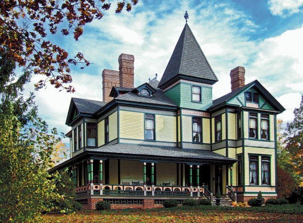
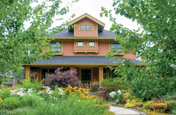
In addition to two body colors—yellow on clapboards and light green on shingles—this 1886 Stick Style Victorian boasts at least five major and minor trim colors, and it all works!
Tony Giammarino
Foundation
The foundation may not even be on the radar as you consider color choices, but getting it wrong can throw off the entire color palette of the house. If the existing foundation is unpainted, leave it as-is. In all likelihood, that aged cement or rusticated concrete block already forms a pleasing visual connection between the house and the landscape. Adding paint to the foundation simply creates a maintenance issue now and for future residents. If the foundation has been painted, repaint with a color that connects the house to the ground, in harmony with the other colors chosen for the house.
Roof
A poorly chosen roof color may overpower the appearance of your house or ruin an otherwise compatible paint-color scheme. Some roofing-shingle shades—the light greys so popular for many years, for example—tend to visually float away from the house in the case of many historic styles, especially those grounded in earth colors like Arts & Crafts houses. A green or red roof, on the other hand, will limit and clarify potential color options, so the body and trim colors should be chosen to work harmoniously with the hue of the existing roof. What if you intend to replace the roof in the next few years? Barbara Pierce says, “If you have an idea for a roof coloration you’re planning towards, you want house colors that are going to work with [the new roof].”
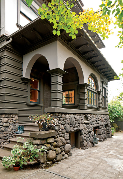
This quiet, naturalistic paintcolor scheme is not about polychrome hues, but rather architecture and proportion. Colors ground the house while highlighting arches and window sash.
William Wright
Fixed Elements
River-rock foundations and brick or stone chimneys help integrate the house with the landscape, so it’s important not to paint them. Pierce recalls clients who picked out paint colors for their home, then went out of town before the painters arrived. “When they got back, the painters had painted the chimney the same yellow as the house, and it stood out like a sore thumb.”
In some cases, one section of chimney might be painted, while part of it is not. Think about what the architect or builder of your house intended when the house was designed. “If you’ve got to paint the brick, do it in a way that visually connects with the architectural thought that went into the original design of the house,” Pierce says.
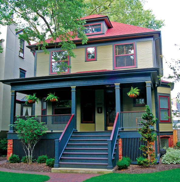
A late Victorian palette in khaki green, dark blue, and cherry red unifies the appearance of Foursquare with a red roof.
Courtesy Greene & Proppe Design
Body
The main body color should work pleasingly with the roof, foundation, fixed elements, and trim and accent colors. While many houses look their architectural best with a single body color accented with trim (lighter, darker, or complementary), some late-19th- and early-20th-century houses successfully accommodate two body colors. Two-toning became popular around 1915, so it’s not surprising that some Foursquares and Arts & Crafts Bungalows were painted one color on the first floor, and a second color of lighter or darker tone above a trim board or water table, especially if there was a change of siding treatment (shingles on the top storey, clapboards below, for instance). On Foursquares, a two-tone scheme emphasizes “a ground-hugging horizontality,” writes Robert Schweitzer, author of Bungalow Colors: Exteriors and the principal of Historic House Colors. While there is no fixed rule about whether the lighter value goes on top or on bottom, Pierce usually prefers to put the darker color on top to reflect the Arts & Crafts sensibility of grounding the house firmly into the landscape.
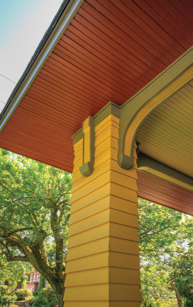
Use bold or brilliant colors sparingly, and only on minor trim such as striping or window sash.
Courtesy CJ Hurley Century Arts
Trim
Often broken down into “major” and “minor” categories, trim elements help the house read as a three-dimensional structure. Major trim includes all the pieces that outline the building, such as corner boards, cornices and gable trim boards, eaves, and door and window casings. Major trim elements are often painted in a color that’s contrasting (complementary) to body color. Others have a trim color that’s a lighter tint or darker shade of the body color. Many houses may be successfully painted with only a single body color and a single trim color.
That said, almost any house with a bit of architectural detail will be enhanced by the introduction of a minor trim color. Minor trim includes doors, shutters, window sash (the part of the window that moves or opens), porch parts, and decorative trim that relates to major trim pieces. (An example of the latter might be a row of dentils on a cornice.) The addition of a well-chosen third color helps the eye “see” otherwise missed details: the dark red muntins of a divided-light window, for example, set against window trim in brown, against a light cream or soft green body color.
Given the preference of contemporary painters for spray technology, adding this third color can be expensive, Pierce notes. “It costs your painter time, so it costs more money,” she says. “If you don’t have the budget for that third color, use the major trim color.”
A fourth color is sometimes called the accent color. It’s often brighter or more primary than others on the house, or even gold leaf. Accent color is sometimes used on bracket details or a chamfer, as pin-striping, or as a loud pop for the front door of a Mid-century Modern house.
The key, of course, is choosing colors that work well together, and not just on paint chips viewed at the kitchen counter. Try any color scheme with sample patches placed in relation to each other on the house. That way, you can see the colors within the environment, subject to ever-changing light and weather conditions. “It’s not about just the body color,” Pierce says. “If you pick green, there are lots and lots of greens. But your green is going to change depending on what trim color and sash color it’s next to, and it’s going to change depending on what colors are in your landscape.”
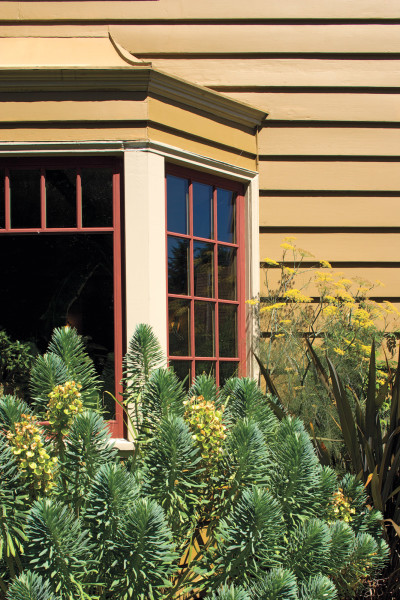
Unafraid of color, the owners wanted a bold, historical paint palette that would complement the lush, colorful garden they envisioned.
Elliott Anderson for CJ Hurley Century Arts
Paint it Right
Buy the best quality paint that your budget will allow, and hire the best painter you can afford—one who will scrape and prep the surface and make any needed carpentry repairs before the first coat of primer goes on. Sheen is important, too. Barbara Pierce suggests avoiding the now-trendy glossy latex paints: “If you put shiny latex paint on an old house, it looks like you wrapped it in plastic.” As a general rule, use flat or eggshell paint for body colors and porch ceilings, and satin or semi-gloss paint for trim.
Color Intensity
The larger the surface, the more intense the color will appear. Try using a less intense color for the body of the house, with a darker or more deeply saturated color for major trim elements like corner boards and gable trim. Use bold or brilliant colors sparingly, and only on minor trim such as striping or window sash.
Our thanks to Catherine Lundie for assistance with this story.