Photos by Steve Gross & Susan Daley
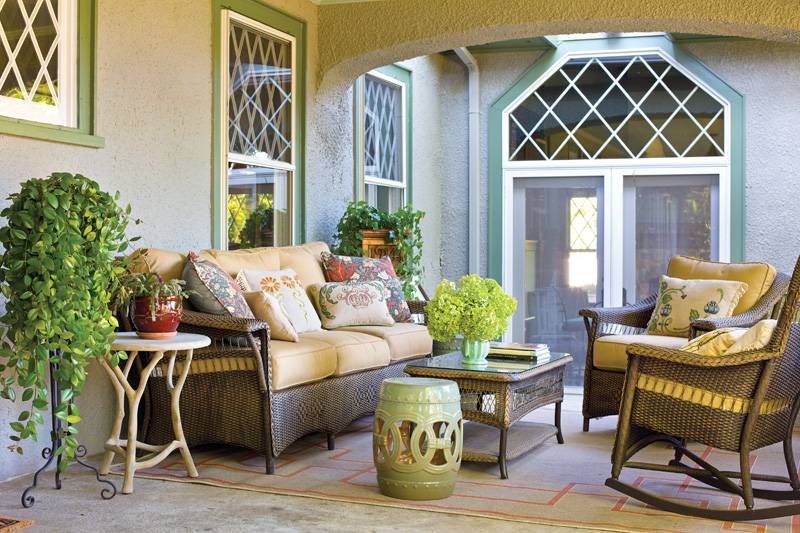
Popular in the 1910s, lattice sash windows are a key detail on the 1916 stucco house. The patterns and overlays were closely copied for new windows.
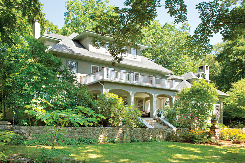
Walk into the foyer of this 1916 Tudor-influenced Craftsman in Mountain Lakes, New Jersey, and you’d think nothing has changed here in a century. But you’d be wrong! Like so many historic houses, this one endured some poor choices made in the 1970s and ’80s. When Dana Pogorzelski and Tim Willke bought the house in 2007, the brick on the massive living-room fireplace had been painted white, and there were track lights on the box-beam ceiling. The most functional entry for the house was through an ugly galley-style kitchen dating to the 1970s. White-painted walls were in stark contrast to the chestnut woodwork.
The knots in the expansive floor plan have been untangled, creating an easy flow that is both family-friendly and true to the historic character. Crucial touches that blend seamlessly include closely matched woodwork and lattice windows in new or expanded spaces.
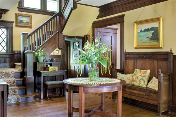
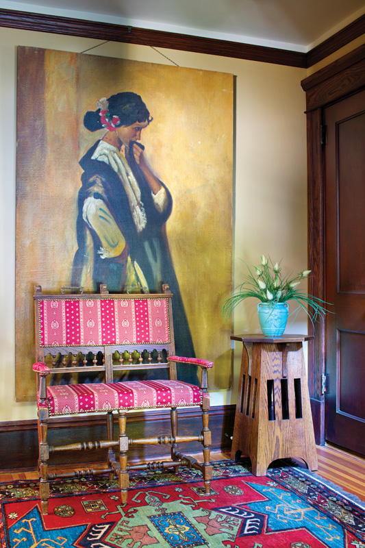
A high-backed bench from the family’s Belgium sojourn complements the original chestnut woodwork in the foyer.
“You want it so you can’t tell where the old house ends and the new part begins,” says Dana. The couple’s success is in large part due to the team they hired. “We had a good contractor, who has since retired, but we also needed a visionary,” Dana says. That would be Carisa Mahnken, who with architect Joan P. Nix reconfigured the existing space so that a new, much larger kitchen segues effortlessly into the family room that, in turn, leads through a large mudroom to the expanded garage.
Get the kitchen right and everything would fall into place; get it wrong and the seams would show. Surprisingly, the driving force wasn’t a desire for walnut cabinets, multiple gathering spaces, or an easy transition to the family room, although the new kitchen design has all of that. The most important thing was accommodating an enormous map of the United States and its historic territories. The 1938 map probably once hung in a classroom, but Tim Willke found it in a local bar. He had a standing offer to buy the map should the bar owner ever move on. When the day came, Tim and Dana were living thousands of miles away in Belgium, but Tim got an email. Knowing they would eventually resettle in Mountain Lakes, Tim bought the map and had it put in storage: “I knew it would be a focal point.”
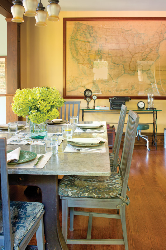
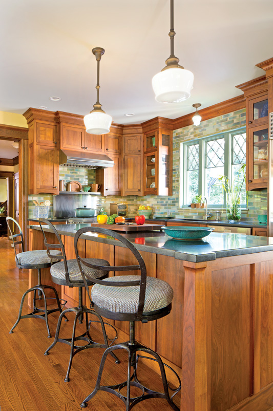
Large enough to dominate a room with tall ceilings, the map got its own wall and the family got a multi-purpose kitchen with two casual eating areas, abundant storage, and a large island. Under schoolhouse pendants, the island is fitted with drawers, like a general-store counter or a chemistry-lab table. The chamfered legs were inspired by details on a vintage Limbert table.
Opposite the island, a larger table topped with a slab of honed, fossilized limestone cozies up to a church pew-inspired bench set between posts. It serves as an architectural divider between the kitchen and the sunken family room. The room easily accommodates six or more people cooking, chatting, eating, working on a computer, or just hanging out. “With a big kitchen, you need more than one work triangle,” says designer Carisa Mahnken. “You need at least two, maybe two and a half.”
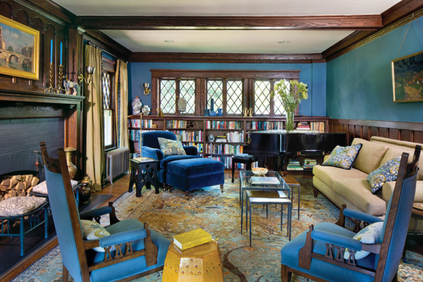
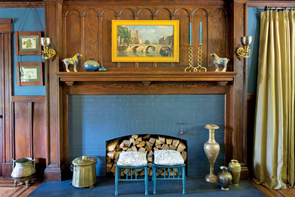
Most of the formal rooms were in good condition, complete with original chestnut woodwork, and they’ve been enhanced by a “dusty” blue, rose, and gold color palette—based on tints in the map. “We deliberately chose jewel tones for the furnishings because the house is dark,” says Mahnken. “If you’re going to keep the wood, you have to work with it and not fight it.”
Liberty stools were an eBay find, spray-painted to coordinate.
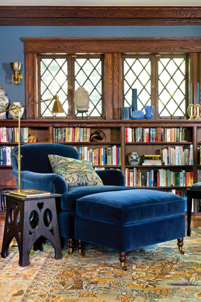
Her success is readily apparent in the library inspired by William Morris’s summer home, Kelmscott. With walls, much of the furniture, and the fireplace surround finished in soft dark blues, the designer chose a carpet with lighter shades of blue, gold, and brown. As the colors flow from one space to the next, so does the flexibility of the furniture. “When we have a party, we can move pieces from room to room and it still works,” Dana says.
While Tim got his map, Dana’s pièce de résistance is a near floor-to-ceiling portrait she calls “The Pensive Senorita.” Dana found it in a vintage shop owned by a friend. At first she was hesitant to buy it because it was such a large painting. She has no regrets now that it hangs on the second floor landing: “The color is perfect for the hallway.”
What is a Hapgood House?
New Jersey harbors several leafy enclaves of Arts & Crafts houses. One is Mountain Lakes, developed by Herbert J. Hapgood, an entrepreneur of spurious reputation, who based many of his plans on neighbor Gustav Stickley’s Craftsman aesthetic. Herbert J. Hapgood had already been arrested for bilking creditors when he began developing this area in 1911. Simple yet large and gracious, most of the homes known as “Hapgoods” relate beautifully to nature and outdoor living. “If a bungalow and a mansion had a baby, it would be a Hapgood house,” says Carisa Mahnken, an interior designer who lives in town. With details that include big porches, stucco, chestnut woodwork, and fieldstone chimneys, early plans offered a California “Semi-Bungalow,” the “Manor House” (a take on Colonial Revival), and a Swiss Chalet.
Despite the developer’s tendency to mortgage some houses twice and borrow money against others never built, more than 500 Hapgoods survive. Hapgood went bankrupt in 1923.