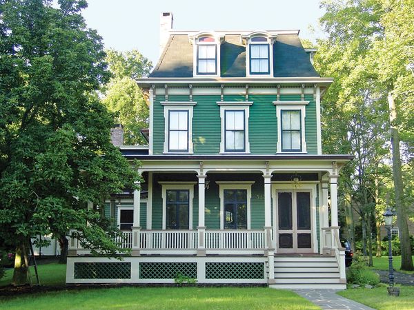
Green body with white trim: a basic scheme here subtly embellished by RobSchweitzer for a house in Westfield, N.J.
Perhaps the single biggest decorating decision homeowners face is what colors to paint the outside of the house. It’s easy to be overwhelmed by endless choices, how many colors or tints to use, and where to put them. When facing a blank slate (or sheet of paper, or primed clapboards), it’s wise to remember that creativity needs limitation. In the case of color choices, context provides guidance, suggesting certain paths and closing others. To narrow your choices down to appropriate colors that please you, let paint color selection be a process of elimination.
First is the context of the house to its surroundings: to neighbors’ houses, to nature, to the quality of light. Context is also provided by “given” colors: a red brick or cool granite foundation, weathered shingles gone brown or seagull grey, the color of the asphalt roof. Guidance comes, too, from architectural context—the house itself. (Furthermore, colors chosen inside the house may provide context for choosing exterior paint.)
What about authenticity? There is only one truly historic color scheme for your house: the colors it was painted when it was built or during the period you are interpreting. But evidence may be gone, the original scheme may have been ill advised, or you may simply hate the old colors. It’s always a good idea to consider the style and era of your house when making a renovation or decorating decision, and certainly that’s true here. Victorian colors and placement will bring out the character of a Victorian house, while a pale Colonial Revival scheme could turn it into a white ele- phant. That said, there are many, many choices within each period. Most people, even the most restoration-minded, actually prefer an interpretation of a historic scheme, adjusted for today’s preferences and real neighborhoods. Related note: The “historical color collections” put together by paint companies have been edited and adjusted for modern tastes.
Beware the hostile use of white! A Shermin-Williams counter card of 1901, the year of Victoria’s death, shows a highly ornamented house with all of its exuberance painted out in white. The 19th century house is done, it seemed to say. But the house is lost. — John Crosby-Freeman, The Color Doctor
Can you pick a successful paint scheme yourself? If the house and scheme are relatively simple, and you test by painting large samples on the building, you probably can, especially if you are using a tried-and-true combination of neutral colors. Otherwise you may want to consult with a paint-color specialist. Some of them are versed in historical colors and architectural style, too. Most work through the mail or by using digital magic and the Internet.
The case studies shown in this article may give you an idea, but you can’t necessarily copy a scheme and get success. Lynne Rutter says that people call her all the time asking for specific colors they saw on a client’s house, but she doesn’t divulge them. “First of all,” Lynne explains, “my clients paid me for custom work and a unique palette. But even more important, using the same colors won’t get the same result—every house is different in its elements and context. For example, San Francisco row houses present only the façade; my scheme shown likely would not work on an East Coast house facing west with a lawn on three sides.”
Early on, paint color options were based on fashion tempered by available pigments. Most pigments in the 18th and early 19th centuries were inorganic earth (mineral) pigments: raw umber, burnt umber, yellow ocher (sienna and burnt sienna) and red ocher (Spanish red and Spanish brown). Used alone or in combination with white lead or lampblack, earth pigments created a surprisingly vibrant range of colors. These “stone colors” are generally compatible with old houses because they match traditional building materials in long use.
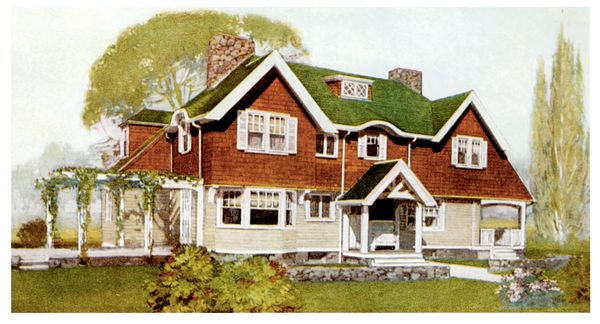
From a Sherwin–Williams color card: an English type of Craftsman-influenced shingled house pairs white trim with the period’s terra cotta and tan. The green roof is part of the scheme.
We think of classical color in the early 19th century. Once again, exterior color mimicked stone, as did construction in wood. In both the Federal and Greek Revival styles, many houses were painted white. But painters added lampblack and pigments to imitate English Portland stone, buff Caen stone from France, and regional stones found in America. In the 1840s, tastemaker Andrew Jackson Downing decried the use of white paint as an affront to the landscape; he thought picturesque house styles like Gothic and Italianate should be painted in harmony with nature, in soft stony shades of brown and grey, in colors that suggested the forest, the rocks. In his book Cottage Residences, he included one of the first published paint charts, advocating three warm shades of grey that evoke New York slate and bluestone, along with three shades of brown that look like wood or sandstone. Another favorite color of Downing’s mixed yellow ochre with white and brown to create a stony gold color. Italianate houses, of course, were meant to evoke the stone villas of Italy; thus buff and straw stone colors are a good choice for these houses, which would have had brown trim during their heyday.
Then came the exuberant Victorian period of architecture—and paint manufacture. From about 1870 until 1900, subdued colors were still used but they were joined by the new colors of manufactured paints. Innovations in chemistry, such as coal tar dyes, led the way to new colors like mauve. A fashion evolved for elaborate houses (think turrets and gingerbread trim) to be painted in complex polychrome (many-color) schemes.
During the Colonial Revival that had begun by the 1880s, house colors moderated back to lighter and softer tones. Houses were painted in pale or soft yellow, light green, and grey tones, with the introduction of white used as a trim color. The number of colors used in a scheme declined in comparison to late Victorian schemes, which had used at least four and up to nine different colors.
Whatever period, whatever scheme, remember that highlighting should organize and lend scale—not create a polka-dot effect. Color placement can make a house seen taller and narrower—or conversely, it can make it seem to hug the ground. Dominant colors and lighter values—that is, those colors that “advance”—should be placed on details that project. This will further lend moulding profiles, column capitals, and raised panels a three-dimensional quality. On the other hand, subordinate colors and darker values—those that appear to recede—should be placed in recesses to emphasize depth. Such placement accentuates the natural shadow effect of recesses.
Finally, a hint that bears repeating: You must paint large-scale samples of chosen colors in place. Buy quarts. Outside, paint a section at least four feet square where body, trim, and accent colors come together (like clapboards and corner board and shutter stile). If you are dissatisfied with your sample, it’s not back to square one. You’ll know, by looking at the color in place, what the problem is: the green is too blue, the contrast too great, etc.


