
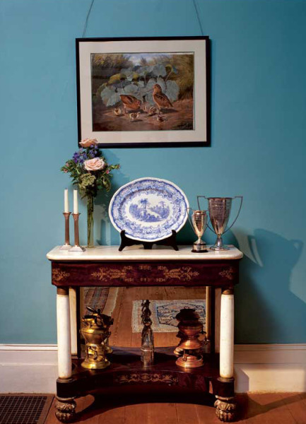
Gold accents in the Empire table are set against a warm, period blue in the dining room at Ames Plantation in Tennessee; trim is classical white. (Photo: Robt Ames Cook)
Blue and white together has been a staple in almost every style of American home décor since George Washington famously painted more than a dozen rooms at Mount Vernon in shades using Prussian blue. Colonial-era coverlets memorably paired white over navy in the “overshot” pattern. And flow blue—the Chinese-inspired dishware with its signature blurred glaze in rich shades of blue on white—was so wildly popular that there were more than 1,500 patterns by the mid-19th century. Even mid-century modern bathrooms were awash in blue and white.
Yet blue is notoriously difficult to work with, and getting white right can be complicated, too. Why? Lisa Skolnik, who edited Blue & White in Your Home, explains: “Although the differences among whites are relatively subtle, [white] can be blindingly bright, slightly off-white, rich and creamy, or silvery and lustrous . . . Effects possible with blue are even more diverse because the contrast among blues is far more discernible.”
Blue has the reputation of being tough to work with. It’s commonly seen as a “cool” color—desirable for a bathroom, say, or a bedroom. But what about an intimate dining room? Or the living room where everyone gathers—no one wants to feel chilly there. Relax! There are warm blues and cool blues, and a shade to meet every taste and mood.
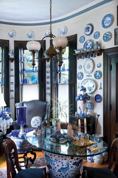
Blue-and-white porcelain and cobalt glass suggested the blue cornice stripe and ethereal ceiling, as well as the saturated blue-black of the trim: many blues in harmony. (Photo: Edward Addeo)
It’s beyond question that every color leans toward what is perceived as either warm or cool. The red/yellow spectrum on the color wheel offers colors considered warm and inviting, which advance into a room and create a cozy mood. The blue/green spectrum is thought of as cool, and receding, which generates tranquility. Yet the thousands of variations on blue (or any other color) in today’s paints and fabrics are created by introducing pigments from other parts of the color wheel. This allows every color family to have both a warm and cool side. In general terms, warm blues are those that contain some yellow.
The tone of white that you choose for your woodwork is also important—white, too, may be warm or cool. White comes in many hues and tints, but broadly speaking, cool whites have a blue-gray undertone, while warm whites have a yellow cast. To determine whether the undertone is warm or cool, hold the paint swatch (with just one color exposed) against a blank sheet of white paper.
Remember, too, that paint formulations changed over the decades; pigments and chemistry affect color. Historical palettes today seek to reproduce colors of the past in modern paints. You might consider, too, that alkyd and latex paints give slightly different results, as does your choice of sheen (from flat through eggshell, semi-gloss, and gloss). Some paint companies offer old formulas (albeit updated for safety and consistent results). For example, The Old-Fashioned Milk Paint Co. has a product (still made of milk protein, lime, and pigment) specifically for non-porous surfaces like walls, in traditional milk paint colors.
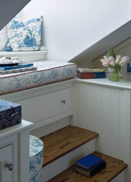
Blue-and-white upholstery and blue accents create the scheme in a plain white room. (Photo: Edward Addeo)
Once you have narrowed down your paint choices, paint large samples of both blue and white on your walls. Paint companies offer literally dozens of whites. Farrow & Ball, for instance, suggests to customers at least two options for white or neutral for each of their colors.
In my own home, I chose a rich cobalt shade called ‘Pitch Blue’ for a small powder room. Since I intended to use the room as a backdrop for my collection of 19th-century English blue and white china, I selected a very cool white for my trim, Farrow & Ball’s ‘Strong White.’ A more antique effect would have been achieved by using one of their alternate suggestions, ‘Shaded White.’
Another crucial factor is the type of natural light your room gets. “A north-facing room will always seem darker than a south-facing one,” notes Lynda Burgess, author of Decorating in Blue & White. “A light room can take cool colors without appearing cold. In a dark room, [cool colors] may have the effect of making the room austere.”
Veteran decorator Mary Gilliatt is unfazed by any complicated calculus of light or room size; she simply picks the color she wants and modifies it according to the season. “Given blue’s calming and refreshing propensities, I have always found it a good background color for living rooms,” she writes in The Blue and White Room. Her rooms are “cooled in summer by white flowers and large green plants; warmed in winter by red or pink flowers, fire, and lamplight.” Designer Jane Grey champions a similar approach: “When I use a large amount of blue in a room, I like to balance it with brighter, warmer colors (gold, yellow, red, orange, spring green) in accessories.”
When accessorizing with blue and white, keep this tip from Lisa Skolnick in mind: “Stronger blues and graphically dense blue-on-blue or blue-and-white patterns will make the room seem smaller and more intense, while pale solid blues and whites and open patterns, especially those with a light background, will make the room seem larger.”
Barbara Pierce, who with husband C.J. Hurley offers a nationwide color consultation service, gives this final piece of liberating advice: “Don’t feel compelled to match your wall color to some element of your soft furnishings. A color doesn’t need to be exact for it to ‘go with’ the elements of the room that are going to stay put.”